Actually, radio station websites have never been very good, going all the way back to the ’90s when broadcasters first started scarfing up domain names. In the early years, radio sites resembled minor league ballparks, loaded with annoying banner ads. Then WordPress came along, and the quality improved – a bit.
But here we are, two decades later, and stations still struggle with their websites. Part of the problem is that talent has gravitated to social media, preferring the instant, real-time feedback they get on Facebook, Instagram, and Twitter. And sales departments have traditionally struggled to monetize station sites. The end result is often a neglected digital asset that underperforms, despite listeners regularly showing up to stream and access information (concerts, station events, etc.).
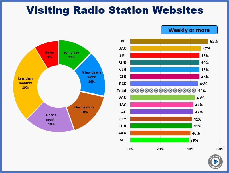
This year’s Techsurvey13 reveals a majority of radio listeners rarely (monthly or less) navigate to their favorite station’s website. And of those who do, fans of spoken word, urban, and rock/classic formats are more likely to check out their favorite stations’ websites weekly or more often. As the chart below shows, this includes News/Talk, Sports, Urban AC, Rhythmic CHR, Classic Hits, Classic Rock, and Rock. On the other end of the spectrum, partisans of Alternative and Triple A are among the formats least likely to visit station sites.

Why the disconnect? Why don’t more fans visit radio websites?
First, stations simply don’t put the effort or strategic thinking into their websites. They’ll test their music, their personalities, and desirable prizes. But it’s a rare station that actually invests the time, energy, and brain cells into ascertaining the good, the bad, and the ugly of their website. Our Digital Dot Connector, Seth Resler, has been all over this issue for years, performing “usability tests” for Jacobs clients.
In an article he wrote this summer, Seth outlined the basic steps any station can take to debug and its improve its website – for under $100. Combined with our Techsurveys, stations can use this data to improve their sites, strengthen their brands, and ultimately amp up website monetization efforts.
Like any other content outlet, websites could make strides if stations took the process seriously. A story in Inc. by Kevin Ryan looks at a recent study by EyeQuant in an effort to delineate five ways websites can be improved. Ryan interviewed Fabian Stelzer, the company’s founder to gain more insights into what works and what doesn’t on websites. His observations very closely coincide with Seth’s philosophy, and can help radio websites get better.
1. Three big facts
It’s important a station website makes it clear the business you’re in, why website visitors should care, and where they can go to engage with your brand. Seth will tell you that many radio station sites fail to tell you they’re a radio station. And most don’t tell you the city or metro they serve.
2. It’s about choice
Websites are often wordy, and too much text is a turn-off. So is clutter, and that’s a typical pitfall on radio sites. Just like in PPM, a key to making sites more user-friendly is to focus on brevity by eliminating unnecessary photos, charts, and long descriptors. The cleaner the site, the better the conversion rate. Think about the stark simplicity of Google, the most popular website of them all.
3. Carousels
Multiple slides on the front page of a website are actually a symptom of bad design and poor focus. When you can’t prioritize what’s important, 9 different promotions, events, or sales come-ons kills conversion rates. Stelzer says carousels are a production of “having many stakeholders involved in a design with many different ideas.”
4. HIPPO
Or the “highest paid person’s opinion” can beat the life out of a workable website design. It’s essential to get feedback from experts rather than letting a boss’ personal preferences win the day.
5. Usability tests
And Stelzer recommends a survey or the kind of simple usability test Seth routinely conducts among just a handful of users. He notes a “key is moving toward a design process that’s as objective as possible.” And you achieve that with basic hands-on testing.
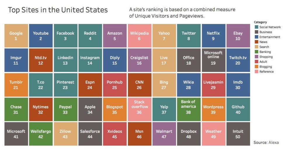
So which websites are killing it? What are the brands that have the most website activity in the U.S? To answer these questions, we simply went to Amazon’s Alexa (yes, HER!) for the latest metrics. She calculates monthly rankers based on average daily visits and total pageviews.
Here is a recent top 50 ranker:
 You’re probably not surprised to see the top 3: Google, YouTube, and Facebook. Amazon is a solid #5, followed by Wikipedia and Yahoo. But you may not recognize a number of these sites, so I’ve linked the Alexa key page.
The pecking order is fascinating. CNN is the first true news site (26), while Apple is well down the list (34). Banks and porn sites are popular, with several sites in the top 50. And not surprisingly, five of the top 20 are social media platforms.
Where’s the music? Apple is in the hunt, but it’s much more than just a music site. Note that Pandora, Spotify, and iHeartRadio are not on the list.
Perhaps that give you some guidance – or even a little solace – about what consumers seek out on the worldwide web.
A great goal to cap off the last quarter of the year is to dedicate some think time and attention to how you can improve and optimize your brand’s website.
Unlike social media, it’s an asset you own.
Thanks to Vala Afshar & Kelsey Neveu.
- Why “Dance With Those Who Brung You” Should Be Radio’s Operating Philosophy In 2025 - April 29, 2025
- The Exponential Value of Nurturing Radio Superfans - April 28, 2025
- What To Do If Your Radio Station Goes Through A Midlife Crisis - April 25, 2025


Kudos on another great post the exposes yet another elephant in the room.
If broadcasters spent the same amount of time they spent posting on Facebook and Twitter and beating up their Air Personalities to come up with multiple Facebook posts a day and put all that effort into their stations’ websites, they’d have higher engagement, move their audiences more effectively, and be able to monetize the increased traffic they’d generate. But many stations would rather let Corporate post most of the content on their site and not understand, as you so wisely pointed out, that (even with Corporate making many of the decisions) in the end the station has full control of their website. And they can do so much more with them, even if it’s just making sure the same “pushed down” content isn’t on every site in the cluster at the same time.
Think of it this way, isn’t it better to own (your website) than rent (as in share most of your data with the platform) social media?
Just sayin’.
I’m right there with you, Mark. It’s a resource that is under-emphasized. A templated approach save money and time, but doesn’t seem to generate great traffic. Thanks for the comment.
Forget about design – is there anything on most station websites that’s unique, exclusive? Are there even archives of morning show bits? Radio sales departments are right not to try to sell them – there is very little audience and at current online metrics, radio websites can’t bring insignificant revenue.
You would think that big companies could spend real money on really good format specific websites. I never understood why they didn’t – broken down by station the cost would be marginal the potential returns very good.
The potential is there, right? This doesn’t seem like a heavy lift for broadcasters, and it could translate to better branding, listener satisfaction, and $$.
Great info! Any examples of good radio station websites getting good returns?
I am feeling pretty good about our stations website now. We reflect a lot of these thoughts and practices. We update the site here in house daily with news, local sports info, community events, audio of our programs and more. We put a lot of effort into these changes at http://www.radiokeokuk.com so this was very rewarding to read for me.
Leah, good to hear you’re sinking time, effort, and thought into your site. Appreciate you reading our blog and commenting.