Earlier in the week, our blog post featured a clever word search study of car lyrics in popular songs. It showed that Hip-Hop and Rap songs far outdistance Rock and Country for the most car references. And Mercedes-Benz was the #1 car mentioned (thanks again to the Hip-Hop contingent).
The post turned out to be very popular as many of you appreciated the use of new technology to tell us interesting stories about the music we love and enjoy – whether it came out last month or in the last millennium.
And that got me thinking about how technology has enhanced our joy of music during just the past few years. Spotify has done an especially good job of using their vast database to tell us about the music we enjoy.
The Beatles meme you see at the top of the blog ended up in my Twitter feed the other day. And I can’t take my eyes off it. It’s a microcosmic example of how technology can be used to help us reimagine a piece of art – not to mention a much-loved piece of our musical pasts.
For me, “Abbey Road” may be my favorite Beatles album (but don’t make me choose). To see it depicted with a wink and a smile as you see in this animated GIF gives me a comforting feeling that technology can be a unique and insightful way for us to re-enjoy and re-appreciate the music we grew up with. And when you think about the way the Beatles used visuals to depict their wacky Liverpudlian ways in films like “Help” and “A Hard Day’s Night,” you have to believe John, Paul, George, and Ringo would approve of this animated inspiration.
As Classic Rock stations often struggle to stay relevant, it is shards of technology like this clever meme that remind us that technology can show us entirely new ways of learning about and appreciating music.
But it runs so much deeper than that. The Pudding is a dynamic analytics team that describes its mission and purpose in this way:
The Pudding explains ideas debated in culture with visual essays. By wielding original datasets, primary research, and interactivity, we try to thoroughly explore complex topics.
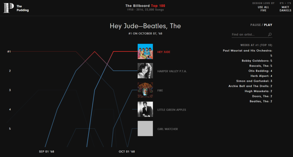
They create gadgets and visuals that help us understand culture and trends, like “How Music Taste Evolved” which breaks down every Billboard-charting Top 5 song from 1958-2016 “so we can stop arguing about when music was still good.”
For musicologists like Sean Ross and Alan Cross, it’s like climbing into the most delicious rabbit hole ever. For the label community, it’s an x-ray of their careers.
For the rest of us, it’s an animated trip into our pasts, the music we grew up with, as well as modern hits – how they rose to to the top, how they endured, and the trajectories of their lives.
If you fire it up over the weekend, set aside a little time to watch how animation brings music and radio to life. And be sure to use headphones because this is an analytics filled with sound. You can watch it here.
This paused screen shot from September of 1968 reveals a lot about radio and music as we knew it five decades ago. Note how long songs remained at #1 on the Billboard chart back then versus the frenetic turnover today where hit songs are lucky to make it for two weeks before dropping back.

To that end, mathematicians, musicologists, and just plain old curious people have used technology to tell us more about the music we love and consume. We’re not just living in a technical audio renaissance where hi-quality sound is available to us at home, at work, in our cars, and throughout our personal space. We are also enjoying a time when all the world’s music is available to us on a device the size of a pack of cigarettes.
How are data scientists using analytics to help us better understand the music we love? Brooklyn-based Matthew Moocarme describes himself as a former PhD physicist turned “information wrangler.” I don’t know him – I happened across his portfolio of analytics by Google Search (of course). It turns out that many of the things we talk about, he uses analytics to prove their validity – or not.
One of my favorite analyses in his repertoire is “Why Does All Country Music Sounds The Same?” I’ll save that for another blog post, but for my Country consultant and programmer friends, here’s the link.
Moocarme has the mind of a PD mashed up with a math acumen that put him in the unique position of studying music in ways most of us cannot imagine. “In Search Of The Ultimate Playlist Title” is one of his typical projects, using formulas and equations that are well beyond most of our skillsets. But the result is insight into how consumers think about the music that accompanies their every mood, and how the power of words can lead to more consumer usage.
In the case of radio stations, how can this information lead to better and hookier format names? We tend to brand our stations with music genres (ALT) or animals (The Eagle) rather than the feelings and moods they engender. This kind of analytics shines the light on different brand concepts that finally transcend the pioneering work of Bill Drake, Rick Sklar, John Sebastian, Lee Abrams, and others who created many of the labels broadcast radio still uses decades later.

Data scientists like The Pudding and Moocarme are enhancing our appreciation of the music around us, whether it’s using search, playlist aggregation, or recommendation engines and algorithms to tell us what we listen to and what we love.
Cox just launched its own proprietary analytics platforms. While other radio companies contemplating hiring their own data doctors, most of the applications CEOs are thinking about revolve around monetization and attribution. There’s nothing wrong with that, of course. We’re talked extensively about the importance of attribution in radio’s retooled marketing efforts.
But data scientists can also jumpstart the audience’s interest in the music radio stations and air personalities specialize in. Your P1 audience – in particular – has a ravenous interest in the music they love. Instead of just playing it 24/7, radio stations (and the companies that own them) have a unique opportunity on the air, on their websites, or on their apps to create tools that engage the audience more deeply in their favorite music.
That doesn’t make listening to live radio any less pleasurable or less relevant. In fact, those who are addicted to playlist services like Spotify will tell you that despite their vast collections of music for any mood, there is something randomly fresh about listening to the radio, where you still don’t know what’s coming next.
That element of surprise – when radio does it right – enhanced by a clever, well-informed or relatable personality is what continues to set radio apart as an audio medium that still dominates music consumption, in spite of the vast array of challengers and competitors.
But numbers – analytics, metrics, algorithms, codes – are all part of the new tools that illuminate the music and provide us with answers. For radio programmers and strategists, it is infinitely more helpful than staring at PUM levels.
In a world where “Freaknomics” has introduced us to new and clever ways of looking at familiar things, these math geniuses reveal a world of music we’ve never seen before.
It’s math storytelling – and it’s fascinating.
Special thanks to Mickey Jacobs & Anne Petrokubi.
- Can Radio Afford To Miss The Short Videos Boat? - April 22, 2025
- Media And Technology In 2025: Believe It Or Not! - April 18, 2025
- In Radio, You Just Never Know - April 17, 2025


FUTURI offers these services and more. And, no, I don’t work with them. But their suite of data services for content programming is stunning. Many Emmis stations have Phd Statiticians on their staff.
The element of surprise is our birthright, rarely used.
Walter, I think we’re going to find that many vendors provide these types of analytics. Question is, how are we using them – just for show prep and for sales OR to make our content sing and provide data to tell new and different stories. Thanks for the comment.