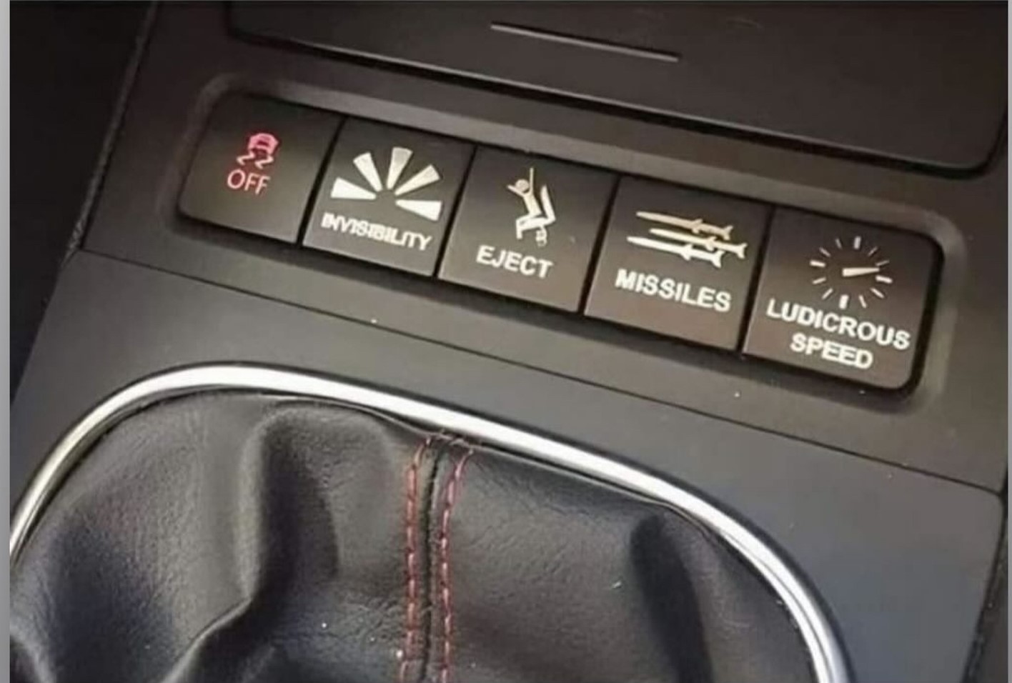
Trendspotting at CES is always a challenge. One year, autonomous driving is the rage. The next year you might look far and wide to find vehicles that allow drivers to clap along with Queen songs.
This has been the case for many platforms and innovations at CES. We’ve seen the metaverse go from the most talked about trend (2023) to being virtually invisible (2024). But when it comes to dashboard screens in cars, two things have been virtually a constant: they have grown in size and quantity.
The Consumer Technology Association’s Steve Koenig calls this phenomenon the “screenification” of the auto industry, a manufactured term that totally captures the essence of this trend.
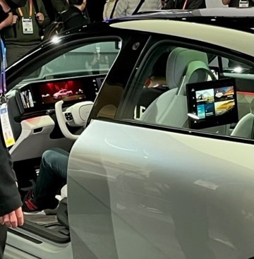
You have no doubt heard me refer to expanded screens that run “pillar to pillar” across the width of the front cabin. Mercedes-Benz put the point on this technology a couple years back at CES when they introduced their “Hyperscreen” – not a concept on a drawing board but available on some of their high-end vehicles.
And then there’s the proliferation of screens in more and more vehicles, seemingly multiplying with each passing year. There are screens for the driver, one for the “riding shotgun” passenger, as well as seatback screens for kids and others occupying the back seats.
The new Lincoln Nautilus features both trends – the first widescreen among American auto manufacturers, as well as multiple screens in the front cabin:
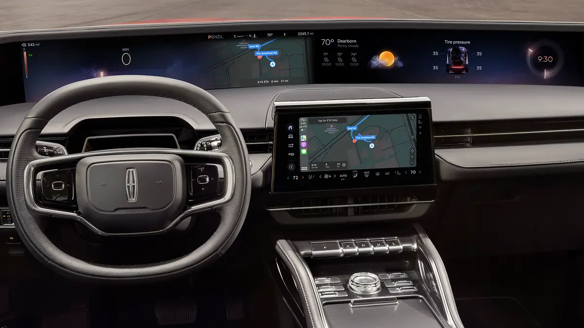
We will be checking out the latest and greatest video screen technology when we return to CES exactly three months from today. (For information on how you can join us, check out the very end of today’s post.) And while I don’t have my swami hat handy, my prediction is that we will likely see even more of the same as we traipse along in West Hall, rapidly becoming an area that looks like a version of the “CES Auto Show.”
But like so many other “innovations” the automakers – or OEMs – foist on us, their technology strategies often leave a great deal to be desired. Clunky infotainment systems where the UX – or user experience – is just plain lousy has cost the OEMs important points in their JD Power ratings that regularly grade their vehicles.
And these days, not every consumer is enamored with touch screens. That point was made in a recent Wall Street Journal piece by Christopher Mims. In “Touch Screens Are Over. Even Apple Is Bringing back Buttons,” Mims makes the point that a “touch screen is a misnomer.” That is, in order to use them you need to actually look at the screen before you press the surface.
Mims notes that in Europe, OEMs like Volkswagen are committing to resurrecting physical buttons, especially for frequently used features such as heating and cooling.
Touch-based controls have been on a tech comeback trail for a few years now. More and more, consumers often gravitate to tactile experiences with their gadgets.
Think about the rise in popularity in turntables, a very hands-on experience. You physically locate an album, take it out of its sleeve, place in on a turntable, and move the stylus to play it. When you’re listening to a music file, likely on a gadget with a screen, the experience leaves the user more removed from the activity of entertaining and/or informing yourself and possibly others.
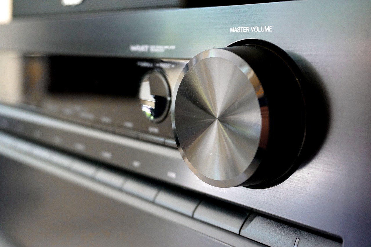
Mims maintains this isn’t just a “touchy” thing. He says buttons – especially big knobs like the massive volume control on old stereo components – actually bring a sense of ease and even joy to listening to music.
Mims cites Apple as proof positive that the “button mindset” may be returning to the gadgets we use and the cars and trucks we drive.
Case in point: iPhone models 15 and the new 16s have an “Action Button” on the upper left side, creating a handy function that doesn’t require touching or swiping the screen.
It does?! Weird, because I have a 15 Pro and I have no idea what he’s talking about. Until I Googled it, of course.
The button in question fires up a black oval at the top of the screen, programmable to do a series of steps with one touch – ex: fire up the camera, mute the phone, etc. You select which action you want to program the button for in “Settings.”
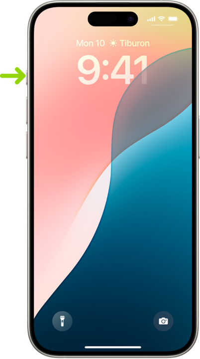
I’ve had this phone since the first of the year, and honestly had no idea the “Acton Button” was there, much less what it did. And of course, consumer knowledge is another variable in this buttons vs. screens conversation.
How many of us actually take the time to learn our devices? And how well do consumer electronics companies and the OEMs take the time and make the effort to teach us how to more efficiently and effectively use them?
 And that brings us to the question of how well manufacturers adequately test and analyze that all-important UX – not to mention cost, because the bottom line is after all, the bottom line.
WSJ’s Mims reminds us that screens are actually cheaper to make than buttons or toggle switches, which explains why just about every device now has a screen, from ranges to toaster ovens. That said, what about ease of use, preference, and yes, safety as key factors, too?
Many of you have met Roger Lanctot over the years, the smartest guy I know in the auto sector. Back during his days at Strategy Analytics, the company actually tested those early model infotainment systems. They’d plop someone behind the wheel of a Ford Edge, give them a basic command like “turn on the radio and select FM 94.7.” And they’d roll the videotape and watch the fun.
Except it was often frustrating to watch as consumers struggled with seemingly easy tasks. And while there was a certain amount of humor – like watching a blooper reel – it was also obvious Lanctot and his company were trying to tell us something about all this hi-tech gadgetry.
After thinking about some of the decisions the OEMs make, you have to question just how much consumer research they’re doing, its validity, and whether they’re actually following it.
I got into it with a tech executive outside radio when the “AM in cars”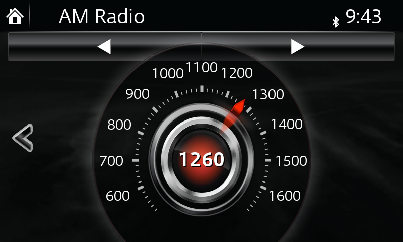 kerfuffle blew up last year. I made the assertion in this blog that the automakers’ research must be flawed because the demand for a radio tuner in cars by the general population remains very strong. We see this in Techsurvey each and ever year.
My friend fired back that my supposition was faulty because the automakers do extensive research on all aspects of their vehicles, including the “center stack” where all the infotainment stuff lives.
If he’s, in fact, correct than the only other obvious conclusion is that economics are overshadowing consumer tastes, needs, and desires. We know that OEMs are balking at the expense of insulating AM radios in EVs to eliminate interference. And some would like to save the money on a radio tuner, forcing drivers to use apps like Tune-In to listen to their favorite local stations.
But the kicker was when GM opted to not install Apple CarPlay in their new models, a decision that is very likely going to bite them in the trunk in the coming years, especially among the all-important younger car buying crowd.
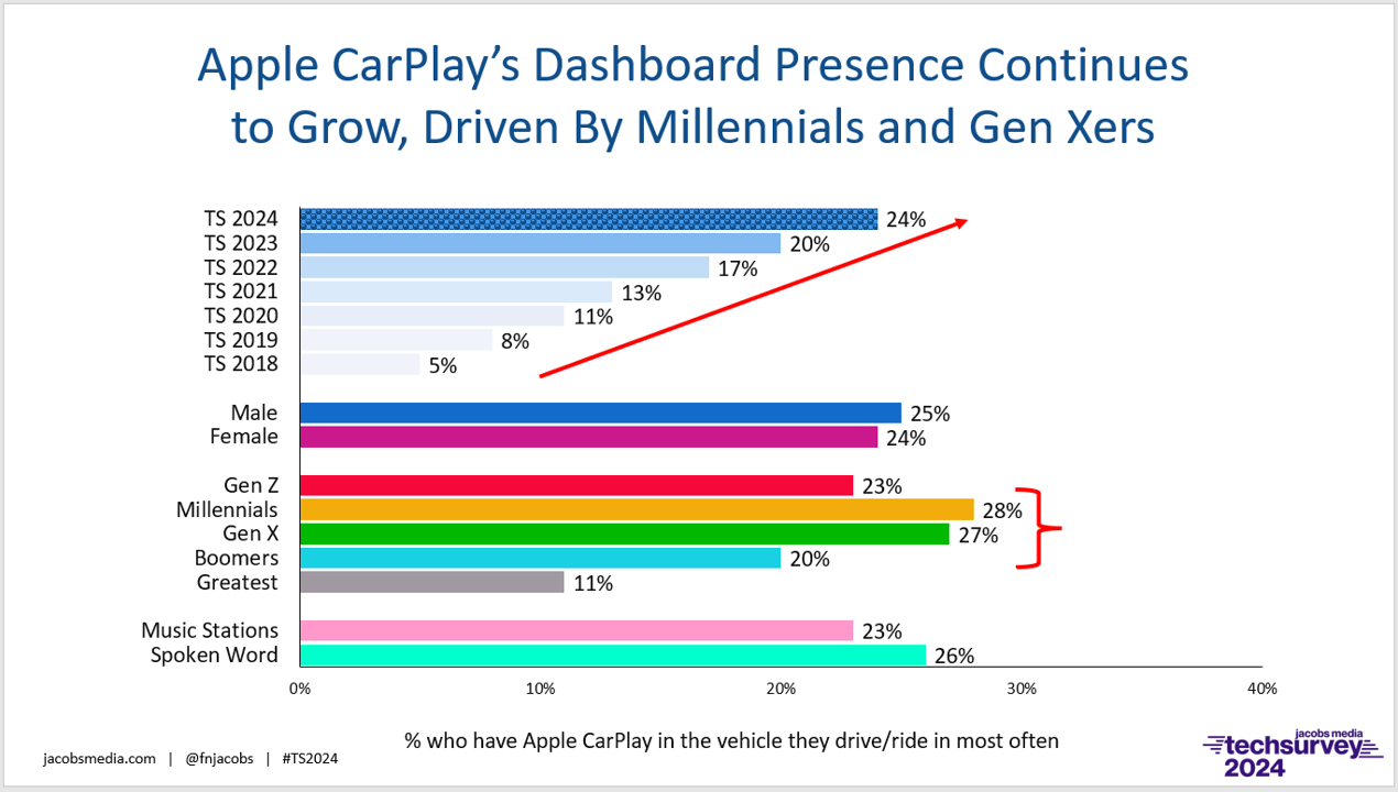
Whether you’re running radio stations or an auto company, ignoring the wishes of your customer base is the quickest route to obsolescence there is.
This idea of buttons versus touchscreens is a microcosm of the larger issue media and technology companies are facing on a very macro level, whether it’s how many hoops they’ll make us jump through and how much money it’s going to cost to watch sporting events on TV that have always been free.
Or how many screens we have to swipe in order to listen to WMMR.
I hope you don’t think I’m being just a little “touchy.”
Thanks to Laura Gonzo!
Come along with us to CES 2o25 in January where you’ll see “screenification” and other trends up close and personal. We just opened up a second tour, but it’s beginning to fill. For more information and to sign up, click here.
- What If Radio Tried Something Right Out Of Left Field? - May 9, 2025
- Why Radio PDs Are A Lot Like NBA Coaches - May 8, 2025
- Memo To Radio: We Have Met The Enemy And It Is… - May 7, 2025


Fun article! This reminds me of the forth generation Corvette “C4” 1984-1996. In 1984 a radically different Corvette debuted and among the futuristic features was an all digital dashboard. By 1990, GM narrowed the digital display to a tiny square in the middle and added a bunch of analog gauges to satisfy consumer demand.
My wife has and loves her ’89 Corvette, but it’s interesting how the digital dash that was intended to be futuristic now just looks quaintly dated. Meanwhile, the multiple analog gauges on my ’91 RX-7’s dash seem fresh and efficient.
Everything old is new again.
I just upgraded to a 2018 Honda Accord Touring automobile and it immediately connects to my iPhone15 Pro and Apple CarPlay appears on the big screen in the center of the dashboard. Since I’m already versed in how my iPhone works, the transition is seamless and very customer friendly.
However, the radio presents challenges. There is an FM button on the touch screen, but now each station has additional options (HD1, HD2, HD3, HD4) and I’ve not really figure this part out yet. (Again, I just got the vehicle.) And I’ve yet to even try and figure out where the AM radio stations are located.
Now I realize that this car is six years behind the new 2024 models, but the amount of technology in this car is a little overwhelming; compared to my 2009 Honda Accord.
What I’m very grateful for is having a real knob for the volume control next to my touch screen.
I also find it so much easier to stream my favorite radio stations versus trying to listen to them over-the-air. The streams are stable, interference free and of high quality.
WTOP and WETA are especially better to listen to via their streams, as I don’t live in their metro area, but over 76 miles away.
The best way to know what your customers want, is to just ask them.
Mayor Koch had it right. Everywhere he went, he asked his constituents: “How am I doing?”
Great thoughts, Fred. Since 2018, car “infotainment” systems have undergone drastic changes, many of which are problematic. Today, many dashboards resemble tablets, filled with touch-sensitive controls that are often more distracting than helpful. Engineers have focused on enhancing graphic capabilities but seem to have overlooked a critical factor: drivers need to keep their eyes on the road.
In the past, early vehicles featured simple radios with six tactile buttons—like 550, 950, and 1180—allowing drivers to change stations without diverting their attention. This intuitive design extended to controls for heating and air conditioning, which required minimal interaction.
Fortunately, my 2018 model limits distractions by only displaying the title, artist, and station information when the vehicle is stopped. However, the prevalence of distracted driving is concerning. Too many drivers sit at green lights, drift into other lanes, or stare at their screens while traveling at high speeds.
As we debate the importance of AM radio in modern vehicles, perhaps prioritizing less distracting dashboards should be at the forefront of automotive design.
Dave, I again submit the OEMs are doing a lot less research than most people think. And to their customers, they should be doing more and better reseearch than they’re doing now. My Lexus SUV’s infotainment system is a train wreck (and I hope I don’t cause one whne I use the system).