As the attention spans of consumers continue to shrink, it’s not hard to see how that phenomenon has impacted brands and branding.
 We speak in shorthand, we multi-task. And we’re always on the move. And smart brands move with us.
We abbreviate everything. The text message turned 20 years old a few days back. But at the beginning, there was no LOL or OMG. Everything was originally spelled out long-form. Then as our time-compressed lives intensified, we developed ways of shrinking conversations and communiques.
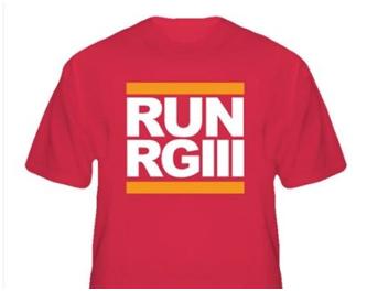
Celebrities and athletes have become abbreviated, too. J-Lo, A-Rod, RGIII and even POTUS are all abbreviated handles that make it easier to move from story to story, tweet to tweet.
You can see it in movies and TV shows as well. If there’s a way to squeeze it into one word or even an acronym, it’s more desirable.
From C.S.I. to House, the key is to edit it all down to one word.
Movies are in that same zone. Lincoln and Skyfall are easy to remember, especially when you’re buying tickets. What were the producers of Silver Linings Playbook thinking? It’s a great film, but the title is an elongated, messy way that misses connections with film-goers.
It’s happening with logos, too, as brands continue to nip at the edges. Emma Hutchings discussed this phenomenon in a recent blog. Here’s her rendition of what Starbucks’ logo might look like in another 30 years:
Yup, down to just a green dot.
And so we move to radio stations.
 Jack, Eagle, News/Talk are all easy, clipped ways of communicating a brand. The ones that describe what the station actually does or plays – better yet.
That’s not to say that call letters are not desirable. But nicknames are helpful, too. Shortening WRIF to RIFF, and KQRS to KQ are ways of creating easy to remember and say nicknames that catchier than four letters strung together.
How can you shorthand your brand to make it easier to remember and even simpler to share and talk about your station or your morning show?
PPM has taught us the value of saying it more quickly and succinctly.
It’s that way in great branding, too.
- Media In 2025: Believe It Or Not! - January 15, 2025
- Every Company Is A Tech Company - January 14, 2025
- The Changing Face Of Social Media (OR WTZ?!) - January 13, 2025


Fred isn’t the likelier progression for Starbucks to be for them to adopt their texting abbreviation: *$ ? That’s my prediction — like McDonald’s adopting MickeyD’s.
You may be right. If I keep spending money on coffee drinks, that’s a good prediction. Thanks for chiming in.
Starbucks might get a challenge from USA Today on the green dot as a logo. The paper recently simplified its logo family with a simple blue dot for the main section, green for Money, red for Sports and purple for Life. On many days that’s all they use, but they often play around with them to highlight a key story in the same way Google highlights a moment in history when it creates a “doodle”.
What’s with all these dots?? Obviously, everyone is thinking of shorthanding their brand. Thanks, Jay.