I’ll bet I know what you’re thinking.
It’s the day after a long holiday weekend, and the last thing you need to deal with is a profound challenge. Or a new acronym, for that matter.
But I’m figuring you’re up to the task, hopefully enjoying the lack of labor this past weekend, and you’re ready for anything that comes you way. And today, I’m bringing it.
It’s something I’ve thought about for a long time now, and I finally ran into a paper that not only addresses it, but also a research study that validates a problem many, many companies are dealing with.
But when you talk to radio people and you bring up this same challenge, you’re more than likely to get a blank stare. Or worse, an acknowledgment the problem exists, but that no one has the intestinal fortitude to first face it, and then fix it.
I’m talking DCX – or Digital Consumer Experience.
Since this blog was launched in 2005, a running theme has been a product, brand, or service’s CX – Consumer (or Customer) Experience. The addition of the Digital “D” brings this issue home to what radio broadcasters are finally focused on – digital delivery of content.
But the question raised by DCX is whether the Digital Consumer Experience is any good – much less competitive – or whether anyone in radio gives a rat’s patooty.
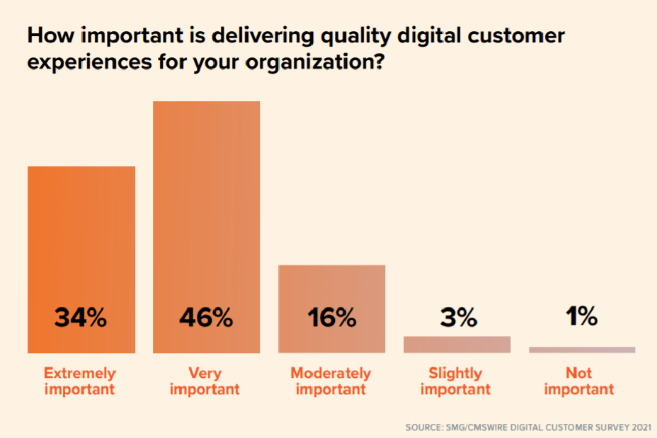
The newest research study in a series of surveys, conducted by CMSWire, reveals that while COVID curbed investment in optimizing digital experiences, attention is returning to ensuring consumers’ changing behaviors are being served by apps, websites, and other connection points brands offer.
The survey encompasses 406 of CMSWire’s readership, conducted in 2020, and reveals most respondents place a high priority on delivering a positive DC:

How might that compare to radio executives? Your guess is good as mine, but in this case, digital assets speak louder than words.
Case in point #1: Station websites.
 You don’t need to be an expert on design to know most radio station websites are designed to simply collect eyeballs and carry as many banner ads as possible. How else to explain the abysmal user experience on most station home pages, not to mention interior pages that are either lacking, neglected or devoid of content altogether?
Developing a stronger DCX for station websites requires no real investment. Seth Resler from our company conducts web usability studies all the time. They are as simple as sitting down a human being in front of your site, and walking her through basic commands and questions.
You start seeing patterns early on about bad navigation, poor labels, and simply the inability to seamlessly find things that are desirable.
You can read up on conducting your own usability studies here using Zoom.
Case in point #2: Station apps
 Our Techsurveys have unequivocally shown that apps for individual radio stations are far more desirable and user-friendly than “aggregators” that glom hundreds of stations together under one mobile roof. Individual apps do more than just stream. They can feature station podcasts, videos, air personalities, donations (for public and Christian stations), as well as myriad other features a core audience prioritizes as important.
But just because you’ve developed your own app doesn’t mean it features a strong DCX. Our team at jacapps sweats the small stuff – the details involving how apps look, feel, and operate. We don’t always get it perfect, but you cannot create a great experience unless you’re willing to go through the nuts and bolts of putting your app through the paces.
Similar to the website challenge, usability studies often discover flaws, annoyances, and “kludginess.” And the main thing is to think of your app holding its own against the other apps on your smartphone’s desktop – whether it’s Facebook, Spotify, or Bank of America. That’s how the consumer sees it.
The road to a stronger DCX in the mobile app space is to simply put your apps through the paces – and show no mercy. Apps have to compete at high levels, or else face deletion from an increasingly fickle consumer base that sets a higher bar every year.
Case in point #3: Car dashboards
 This is an area that is near, but not-so-dear to me and our Jacobs Media team. We’ve long been focused on the automotive landscape, and radio’s ability to compete against an increasingly crowded dashboard full of options.
Satellite radio, digital streaming platforms like Spotify, podcasts, and auto ecosystems such as Apple CarPlay and Android Auto make things much more competitive in cars for FM radio.
And let’s not forget – COVID and all, the car remains radio’s top listening location. We don’t have to look any farther back than 2020 to learn what a disrupted in-car experience can do to radio ratings.
But even as consumers return to commuting, errands, and other adventures on four wheels, car dashboards are becoming bigger, brilliant, and capable of delivering more to drivers and passengers.
Is radio keeping up? Barely.
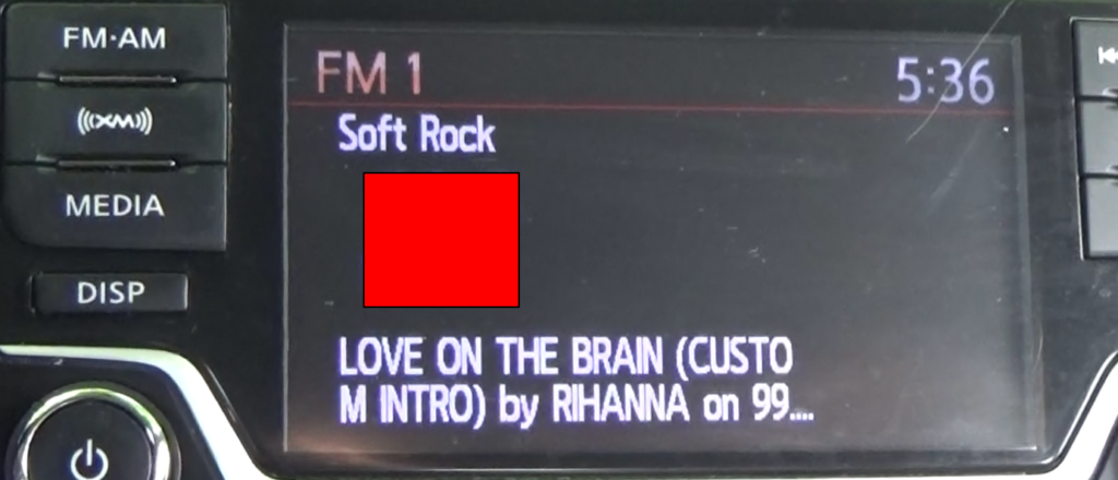
If you don’t believe me, sit in your car for a half hour, and “scan” your way up and down the FM band. How are stations displayed – during music, during talk, and in commercial stopsets. This last leg of the stool – commercials – has become increasingly ugly in recent years as some sales teams take the approach of simply cramming together as many ads as possible on the dashboard screen. The results often look like…well, radio websites.
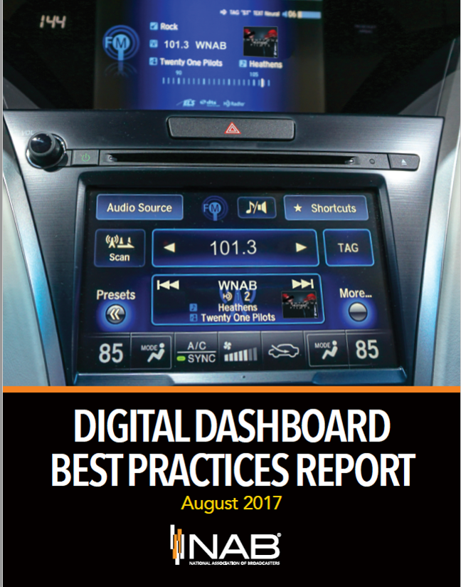
To gain an understanding of the DCX in car dashboards when the radio was on, the NAB hired Jacobs Media to conduct a dashboard audit in three different markets back in 2017. We literally tracked and logged the dashboard display every time the “scan” button stopped at a radio station starting at 88 and going all the way to 108. And what an eye-opener it was.
Along with engineer extraordinaire Glynn Walden, the NAB published a free DIY guide – for both programmers and engineers – with the goal of motivating broadcast radio in the U.S. to get its metadata house in order. You can access the report here.
The results of this initiative were checkered. To their credit, a number of radio companies jumped at the opportunity to upgrade their dashboard experience. Unfortunately, many others ignored the report or simply do not believe how radio looks in the car has become every bit as important as it sounds.
This year, we’ve been back at it – studying how metadata is displayed in cars through the eyes of drivers. We’ve conducted a series of one-on-one interviews among radio listeners, exposing them to the good, the bad, and the ugly when it comes to metadata in cars.
Commissioned by Quu, the results were eye-opening to us. In just a few weeks the data will be shared with radio broadcasters in the hope we can stimulate the industry to “up” its in-car game.
In the big picture, all these components are part of radio broadcasters aspiring to a higher level of digital experiences.
It is no longer enough to simply offer content on more distribution platforms. It is ensuring those moments when fans download your app, visit your website, or punch up your station in their cars, the end result is seamless, reliable, and even elegant.
The onus is on radio to improve its experience, to remain competitive, and to prove it can hold its own with the big boys and girls.
As for how well radio’s content competes in 2021, that’s a blog post for another day.
Until then, how’s your DCX?
- How AI Can Give Radio Personalities More…PERSONALITY - April 23, 2025
- Can Radio Afford To Miss The Short Videos Boat? - April 22, 2025
- Media And Technology In 2025: Believe It Or Not! - April 18, 2025


Hi Fred:
One other area that really needs to be explored are the ads that run before the app connects to the station. I sat thru a 2 min cluster recently which was annoying. And when you consider that OTA radio (traditional radio) runs spots…I’m not sure why companies feel like they have to run between 2-4 :30’s that cannot be fast forwarded. If we’re going to run spots b4 the feed launches, it should be limited to one 10 or 15 sec spot. Would probably attract and keep more listeners stuck on our apps.
Once again, David, it’s a case of going after the revenue, and not considering the consumer. Radio can’t keep behaving this way in a digital world. Thank you for the comment.
Fred – Thank you for this important post. I had a major loss of my vision in July 2020. Now, I am living and working with low vision. Many media oriented websites fail in the basics of legibility and site navigation, including public radio websites and apps. Those of us who work in communications need to be aware of roadblocks that diminish the effectiveness of our messages.
Ken, thanks for the comment. A woman I’ve blogged about, Alexa Heinrich, has made it her mission to advocate for accessibility online. I have begun to develop a deeper understanding of how it all works. Appreciate it.
Thanks Fred. I found Alexa’s website and I agree with you about her work.
Ummmm….elephant in the room….the ad-inserted station streams themselves. It’s a rare stream that sounds as good as the broadcast product. All the platforms you suggest rely on a quality stream. Are we there yet?
Not even close, Beverlee. In PPM markets, there are two compelling reasons to simulcast streams: 1) Total Line Reporting more often than not adds to a station’s ratings/share, and 2) radio hasn’t figured out how to make ad-insertion sound listenable. Thanks for mentioning that big pachyderm.
From teeny tiny logos to irrelevant content to virtually NO reason to listen to the station (and therefore no reason to return to the website) to virtually invisible talent to.. well I COULD go on but the experience of hitting up a station’s website when you can find most of their content on Google News is really -as you said it Fred, for the revenue and not the consumer. Listeners go there-get disappointed (or confused) and if you don’t bring them back? – you lose.
Dave, there’s no reason why radio couldn’t have it both ways – well-designed, helpful, attractive websites with solid, focused content. Properly promoted, the would attract more eyeballs than station sites attract now, thus generating more revenue. But early on, these sites became dumping grounds, where excess inventory could live with virtually no caps or limitations. Of all the challenges posed by yesterday’s post, this is an easy fix.
On point, yet again, Fred. Radio ears are deafened by sales. Self defeating. Hearing how ham handedly that broadcast handles digital. No skip spots before going to the station, and then the others who bait and switch running an entirely different feed that does not come from the transmitter. Facebook handles dead friends about as well as (many) broadcasters handle their online assets. Luddites begets satellite subscriptions. Gotta’ say, you’ve kept your keen insight Fred. Your crew too. Kudos .
Appreciate your comment and your clever observations. Love your take on dead Facebook friends – so awkward and so true. Thanks for reading my meanderings.