As we all return to work for the third half of the year, I wanted to start this short week with something that is hopefully inspirational and motivational. Given the abundance of media, gadgets, and entertainment in our midst, it’s often difficult to get our heads around who’s winning, who’s losing, and who’s in the vast middle.
That’s one of the reasons why we’ve continued to produce Media Usage Pyramids as part of our annual Techsurveys these past 12 years. Now we realize these mega-studies are composed primarily of people connected to radio stations in some way – members of email databases or station social pages. But our web-based studies have been incredibly trackable and predictive about how consumers enjoy their increasing choices for content and devices.
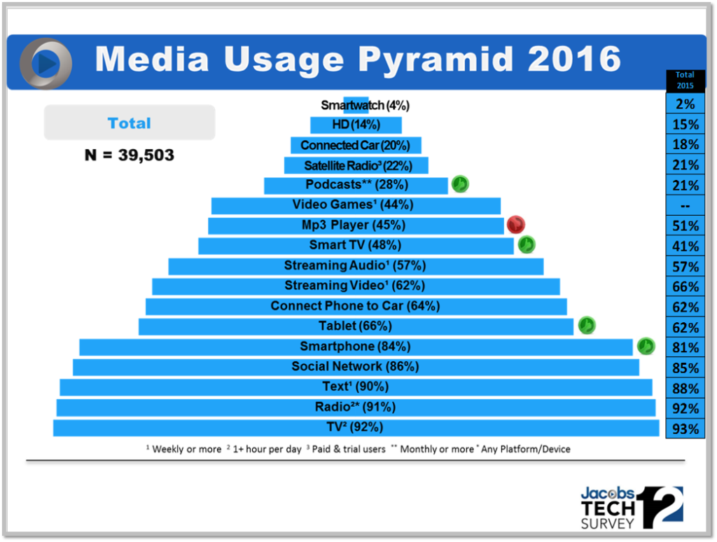
And while our world has been rocked by technology over the past decade or so, the results are impressive for radio:

The “stripe” on the right shows last year’s data. Overall, our study reveals that more than 90% of our mega-sample (39,500+) spends one hour or more a day watching TV and listening to the radio. Both are down a tick from last year, but hanging in at the bottom – or foundation – of the pyramid.
We use thumbs-up and thumbs-down symbols to denote interesting movement from the previous year. Smartphone and tablet ownership continues to move up. We’re also seeing big growth for connected TVs, as well as monthly podcasting, suggesting a surge in both video and audio on-demand consumption.
But despite all the options made available via new media, devices, and platforms, radio continues to dominate in the reach department.
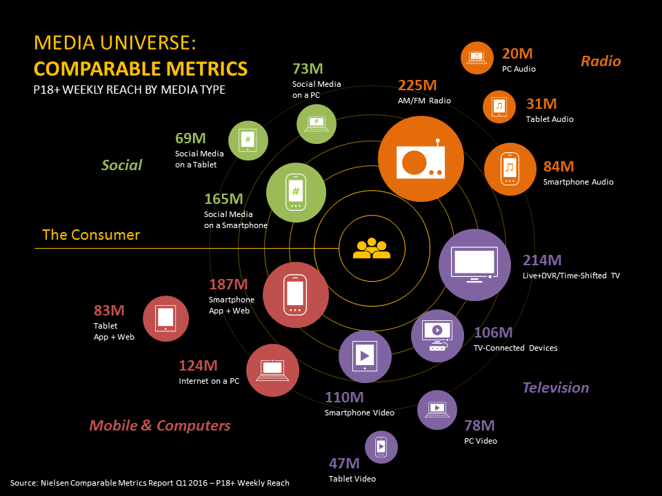
So our pyramids are one graphic way of looking at the media landscape. Nielsen just released a different representation – the media solar system. And this infographic proves to be a fascinating view of weekly reach across many different media and devices.
 Nielsen’s parameter is weekly reach among adults 18+. And interestingly, radio bests television by a narrow but clear margin. Everything else pales in comparison.
In our travels, meetings, and appearances at conferences and conventions, we continue to run into smart media people who invariably underestimate radio’s reach. This interplanetary graphic is a wonderful way to visualize radio’s impact in what Nielsen calls “The Media Universe.” So maybe it would be a good idea to hang a few of these charts around key points at your station, as well as in sales presentations and in jock meetings as reminders of radio interstellar impact.
Of course, while this chart speaks to the power of tradition and the status quo, a good way to think about radio’s dominance and the challenges that lie ahead is this:
Don’t rest on your laurels – build on your strengths.
Radio’s reach is a truly impressive metric, especially given the way new platforms have exploded across the media solar system. Despite the changes across the media universe, radio continues to be the most popular consumer choice. But engagement is a necessary element in the race to remain relevant and healthy. Reach is a major advantage, so the opportunity lies in optimizing it and ensuring radio’s cross-generational appeal.
Here’s hoping the planets line up for you throughout the remainder of the year. Thanks for reading our blog and participating is always a fascinating conversation.
- What Is It With Female Robot DJs? - April 30, 2025
- Why “Dance With Those Who Brung You” Should Be Radio’s Operating Philosophy In 2025 - April 29, 2025
- The Exponential Value of Nurturing Radio Superfans - April 28, 2025


As a former radio seller and sales manager, I’ve always been perplexed by radio’s reliance on reach as support for its value. Back before the digital stuff happened when radio’s reach was widely known and accepted, few buyers/planners/account management cared all that much. I can’t speak for now, but back then, radio was valued much more as a targetable media than for its fully acknowledged reach.
Now that radio’s reach is often underestimated, I understand wanting to set the record straight – but unless buying criteria have changed significantly to value reach more, the reach misperception probably doesn’t impact sales all that much.
The reach piece is more of a vanity metric. It might not be an accepted media buying piece of data, but it does settle some scores when it comes to misconceptions about radio’s relevance. TSL may be diminishing, especially among the young, but the fact that reach remains high is an indicator that radio very much holds an important place for most people – in spite of all the competitive noise. Thanks, as always, for taking the time to comment.
Well said … it’s easy to get caught up with all the new apps and technology ( sales) …and while they can be productive complements to the On air brand , They are not the brand so they shouldn’t get ahead of themselves … I actually think TV or cable should be worried more than radio …. maybe there is a synergistic opportunity in the future …hmmmm.
Hope you had a great Holiday weekend Fred
Frank, thanks for the comment and the kind words. Data like this help us keep it all in perspective. Best to you, Frank, throughout the rest of 2016.
HI Fred,
As always, thanks for the effort to keep this conversation alive. I have two questions: First, am I correct in that the source of the 39.500+ sample came from radio station databases? Second, can we obtain copies of the “media universe” chart directly from Nielsen?
All the best to you…DG
You are correct that the majority of our Techsurvey12 sample is derived from radio station databases. All the more interesting when you consider that Nielsen’s numbers reflect a similar hierarchy. I’m sure Nielsen would be happy to give you their infographic. Thanks, Dennis.