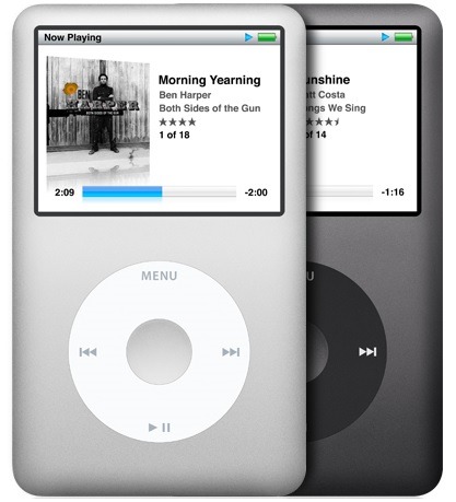
Remember the first time you played with an iPod and you saw that fabulous album artwork on the screen?
It was one of the early signs that digital technology could rock our worlds, and change the way that we listen to and enjoy music. Old school vinyl records have made a comeback in recent years, boosting a comeback for the appreciation of album art. But the way that albums and artists are digitally displayed has become a larger part of the music ecosphere. The look and feel of the music is as important today as it was when albums ruled the musical world.
Whether you’re in a car, listening to music on an mp3 player, a smartphone, or even enjoying it on a smart TV, the rich way in which it is now displayed cross-platforms is altering the way consumers visualize the music they love.
That’s a big reason why the radio industry’s efforts over the past few years, from iBiquity’s HD Radio “Artist Experience” to NextRadio’s “Tag Station” model, have refocused on the way the music “looks” on the radio.
But it goes beyond the display on dashboards or on mobile device screens. It has to do with the way the music is being celebrated by broadcast radio’s growing number of competitors.
Say what you will about Pandora, their brash offensive against broadcasters, their audience size claims, and their foray into the advertising world – founder Tim Westergren is a true lover of music who channeled his passion into creating the world’s leading pure-play.
And all the while, broadcast radio continues to treat music like a commodity, especially during the testing, sorting, and scheduling process. And at the same time, FM radio’s digital competitors lovingly embrace the music and worry about the aesthetics. The lesson that Steve Jobs taught gadget makers and digital music platforms is that the look and feel of content matters. If you make the music look beautiful, it becomes even more powerful and attractive to the people who consume it.
It seems like just about everyone’s gotten that memo, but somehow it has eluded many broadcasters when it comes to displaying, curating, packaging, presenting, and celebrating the music.
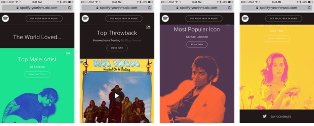
This hit home for me the other day when Saga programming guru, Steve Goldstein, sent me a link to Spotify’s “Year in Music” that I’ve linked here. Open it on your phone.
Not only is it clever, it’s robust and it’s beautiful. And it makes you want to dive in and enjoy the music. Here’s a sample of the screen shots I took for various artists and their achievements:
They’re colorful, striking, and they run the gamut of music, then and now.
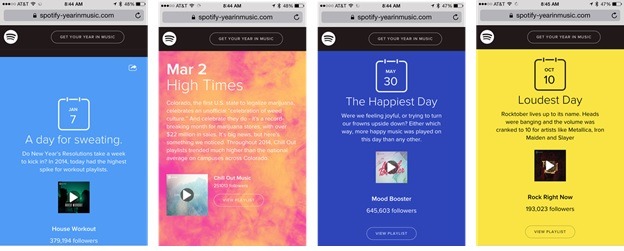
But it gets better because using their “big data,” Spotify is able to pull out some fascinating information about song consumption that is reminiscent of music radio stunts. But their milestones are all derived from actual streaming on their platform:
We find out, for example, that January 7th was the day that more people used workout playlists, an obvious sign that New Year’s resolutions were still alive and well. Or that “Chill Out” playlists get more use in Colorado, the first state to legalize pot. Or that “Rocktober” (yes, they use that term) is the real deal on Spotify as evidenced by metallic airplay on October 10th.
There are the kinds of fun facts and interesting programming (yes, they’re doing programming on pure-plays) that Spotify is developing to make their platform more compelling and cume-worthy.
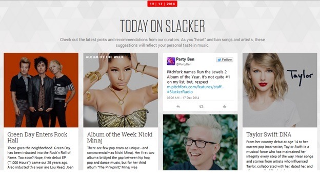
Slacker has similar programming displayed on its front page, including channels and features that are updated daily. This screen shot is from yesterday, and includes everything from a tribute to Hall of Fame inductees, Green Day, to a Taylor Swift DNA channel.
This homage to the music and how consumers enjoy it is something that radio used to do a lot more of – pre-PPM. Stunts, countdowns, pay-for-play fundraisers, and other “re-shuffles” of the music library were integral parts of what kept broadcast radio vital, beyond the day-to-day scheduled music. When you look at some of the examples I’ve shown here, they’re fun, interesting, and they make you more curious about the music.
It wasn’t that long ago that FM radio used to do this all the time. Stunts like the “Rock N’ Roll Olympics,” “Rewinds,” of course “Rocktober,” and other thematic features were staples on many stations in a variety of different formats.
As broadcast radio has shied away from these stunts in a flight to ratings safety, everyone from satellite radio to pure-plays is embracing these same tricks and tactics that broadcast radio programmers made famous way back when.
This was the promise of HD2 and HD3 channels when that initiative got off the ground nearly a decade ago. Sadly, that potential for experimentation and the kinds of things one hears every day on new digital platforms has been mostly lost.
After a while, even die-hard music fans get tired of hearing their playlists – or ours. Embracing the music on station websites, during weekends, and to celebrate days like the anniversary of the passing of John Lennon or welcoming new members to the Rock Hall of Fame are part of what made FM radio a special place to enjoy music.
We keep hearing that music on broadcast radio is on the endangered species list.
Maybe part of the reason is the clinical, mechanical, one-dimensional way it is often displayed, predictably programmed, hastily voicetracked, and presented.
This is not an argument for musical depth. It is about acknowledging that consumers are experiencing music on many platforms that aren’t broadcast radio. And that experience continues to get richer and more interesting over time. The pure-plays are discovering they have to do more than provide playlists and boring channels. They are working harder on their user experience.
So how’s your music UX?
- What To Do If Your Radio Station Goes Through A Midlife Crisis - April 25, 2025
- A 2020 Lesson?It Could All Be Gone In A Flash - April 24, 2025
- How AI Can Give Radio Personalities More…PERSONALITY - April 23, 2025



Excellent blog Fred! We shared with all of our PDs this morning.
Glad to hear it resonated, James. Thanks so much for the gratifying heads-up!
So great. Thanks for the head-smack Fred. I was one of the kids staring at every picture and reading every word on the back of the albums I bought. I watched my daughter do the same thing with the Taylor Swift CD she bought a few weeks back. Lets celebrate the music with our listeners again.
Jack, much appreciated. Now that you mention it, I seem to be going through a “head-smack” phase on the blog. And I think the reason is that I see broadcast radio with so many assets but not always doing a great of communicating them in a more complex media environment. Thanks for taking the time to comment.
Another hit, Fred. Keep ’em coming.
Can we start by making sure the artwork from the correct album is displayed when a song plays? Not the greatest hits, live collection, box set or CD remaster with bonus tracks, but the actual album where that song first appeared, the one we bought at the record store. It’s a little detail, but a pet peeve of mine.
Also, why can’t that album graphic expand with a click to include the back cover, inside, sleeve and any inserts? Surely we have the technology. Go the extra mile for the listener or don’t expect them to reciprocate.
Thank you, Russ. And I share your concerns when some of these “digital touches” are so obviously skimmed over – as if no one really notices. The little details, the outages, and the mediocre UX get noticed by consumers, whether it’s the subtle things or it just happens over time. Whether people are conscious of it or not, they are comparing – FM radio to satellite to pure-plays. It is so important that broadcasters show up and make these impressions count. I love your last line – says it all. Thanks again for taking the time.