There’s a lot I enjoy about program consulting. Sitting down with programmers and marketers to map out strategy, planning station events, working with dynamic and entertaining personalities, developing community connections, and helping keep broadcast radio vital. This is a part of what I try to do every day for great stations, as well as those who aspire to greatness.
And I get paid for this. It is, in fact, a wonderful life. That is, until a client informs me there’s a project afoot to develop a new station logo. Those are the moments where I wish I could just let the call go to voicemail.
First, most of the people assigned to the “logo project” are patently unqualified to take on this mission. Including me.
Second, aside from cosmetic updates and a tweak here and there to an existing logo, a complete makeover or full-bore redesign is a daunting task.
Third, logo initiatives have sweeping impact. By the time everything is reprinted, re-skinned, and redone – stationery, business cards, the website, the app, digital assets, the station van, and merch – a lot of money and time have been spent – often on a very arbitrary process and a sloppy decision.
These challenges occurred to me when I read the story about the design of the Paris Olympics 2024 logo in AdWeek. As you can imagine, this had to be a major undertaking, involving scores of people, months and months, and millions of dollars – or euros.
AdWeek’s Doug Zanger traces the evolution of this aggressive new logo design, and below you can see what they came up with. Give this a good look, and then we’ll talk about what it means to any brand endeavoring to develop a new logo or modify their current version.
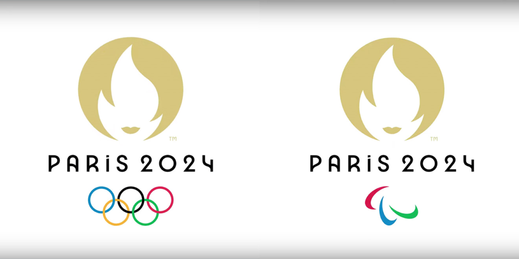
So, what do you see?
My first impression was a golden flame. But then I read Doug’s story, and “discovered” that it’s also a female face depicting the female symbol of the city, Marianne.
Never heard of Marianne? Don’t feel bad. Neither did I – and I’ve been to Paris twice. Unbeknownst to me, she’s been a symbol of the city since the French Revolution, and is depicted all over town.
But the Olympics logo isn’t just for Parisians – it’s for the entire world. And while using an Eiffel Tower or an Arc de Triomphe symbol might have been cliche, it sure would have given this new logo design a clear sense of place.
Of course, that’s just me. And as I’ve already explained, I am not an expert in logo design. But thankfully, Zanger enlisted the help of more than a dozen design experts – people who make their livings doing just these types of projects.
The disconcerting thing, however, is that Doug’s deep dive into this logo is that many of the designers he interviewed couldn’t agree either.

Only one loved it – Mohamed Elhawary of Dear Future. He appreciated the feminine symbolism, hoping it might position the games as “a life-changing opportunity that is in their grasp.” He stood alone with that opinion.
A couple liked it. Peter Knierem of Fortnight Collective pointed to the relevance of the logo for the city of Paris. But he also expressed the concept that it’s “a bit over-French for a world event and celebration.”
A half dozen designer members in Doug’s panel gave it “OK” grades. Partners + Napier’s Rob Kottkamp felt the design team “went too far down the conceptual rabbit hole to the extent that the mark requires an explanation to be understood. I also do not get the spirit of sports when I look at it.” Oh yeah, there’s that.
And then there was an octet of designers – mostly women – who gave the logo an “Ugh” grade. Have Her Back Consulting’s Caroline Dettman summarized her comments by simply stating “the whimsical design misses the mark.” And Marian Williams of OKRP contended the logo “lacks energy,” and she was “distracted by the face and hair. It’s making a reference for France but loses a lot just to showcase that little bit of cleverness.”
So, while the grading scale varies wildly from design maven to design maven, many landed at about the same spot for this logo. Some simply like it more than others – or vice-versa. But most agree, it misses the mark.
That said, many are talking about it, debating it, and arguing over it. And it will most definitely sell a ton of merch and log0-related products.
Doug’s story reminded me just how precarious logo creation, execution, and selection can be. When worldwide art and design experts cannot agree, what happens when you assemble a station’s executive team, the group programmer, the G.M.’s spouse, and a consultant from out of town – none of whom have an eye for this stuff?
Earlier this week, I had lunch with Mark Pennington, program director of the venerable WRIF in Detroit. We were “mentoring” National Radio System/Benztown student, Nick Tehrani. Mark mentioned WRIF’s upcoming 50th anniversary, and Nick wondered whether there were plans to modify the station’s logo to make it more appealing to a younger audience.
Without batting an eye, Mark told him the logo has been the same for 50 years (mostly accurate, except for a “blip” in the 80’s, when the station was sold). Changing something so visually familiar and iconic “would be like Nike changing the ‘swoosh,'” noted Mark.
He’s right, of course. A large percentage of Motor City denizens can describe the WRIF logo – without even seeing it. Much of that comes with consistency, but also the fact it has been marketed – at times, heavily – over the decades, and the station has remained (mostly) steadfast about not changing it.
Mark’s position, however, also speaks to something just as important – being consistent in a world of change and fluidity. The WRIF logo has 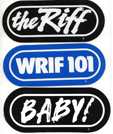 been tweaked – hundreds of times – to reflect artists and bands, sports teams, station personalities, events, and other catchwords – but the essential look is exactly the same.
And in a world of constant flux, where seemingly everyone is redesigning, refreshing, rebooting, pivoting, repositioning, and repurposing, the one constant is a Detroit radio station that as David Lee Roth once declared, “Always had it, always will.”
That’s what WRIF has meant to the Motor City, and why the original logo isn’t going anywhere. The logo is a visual representation of stability, consistency, knowing what you stand for, and being true to your values.
That’s not to say you shouldn’t be thinking about a logo makeover for your station. It may be just the thing you need to breathe life into your brand.
Just don’t ask me what I think of it.
- Why “Dance With Those Who Brung You” Should Be Radio’s Operating Philosophy In 2025 - April 29, 2025
- The Exponential Value of Nurturing Radio Superfans - April 28, 2025
- What To Do If Your Radio Station Goes Through A Midlife Crisis - April 25, 2025



A question for you on this Fred. I am the OM for a cluster of stations in Southern Illinois. We have a rock station that is celebrating 50 years in 2020. We recently received one of the first t-shirts of the station with an old logo and my desire is to reissue those t-shirts with that logo. Would that be a take away from our current logo? Our would it be a great nostalgia piece?
I’ll toss in my two cents and vote “great nostalgia piece.” I think it could be kind of cool and fun to see “how it was” while retaining the current image. I know there will always be a special place in my heart for the big “Q” logo the station I grew up on, KCBQ, had in it’s heyday. Think of it as the way NFL teams are sporting “throwback” uniforms in selected games. Your main design may best represent who you are today, but it can still be fun–for both old and young–to look back and see “the way it was”–at least when appropriate. I think a station’s golden anniversary clearly is one of those times. (Just save me a shirt!)
You might have your cake and eat it, too. Put the retro logo on the front, and the current logo on the back. Should work well. (Men’s large)