This coming weekend, Paul and I will be moderating another panel revolving around broadcast radio, the connected car, and dashboard display. We’re honored to be on the big stage for this event, especially as the NAB reconstitutes in Las Vegas, following several challenging pandemic years.
Joining us will be a an all-star panel of pros who know this space inside and out. The session is aptly titled, “A GPS Session for Your Station’s Car Radio Strategy,” because in spite of years of talk about the importance of the car dashboard, three DASH Conferences, and an NAB committee devoted to this important topic, most broadcasters still to not have a car radio strategy.
Our panel features Lesley Rohrbaugh, director of research for the Consumer Technology Association (the folks who produce CES), Steve Newberry and Suzy Schultz from Quu (the company pioneering dashboard display), and Joe D’Angelo of Xperi, presenting his company’s AutoStage, the best layout of broadcast radio in the car that I believe we’ve seen.
Our mission? To explain the current state of the art in the connected car arena, and demystify it for our radio broadcasters in attendance.
I get it. It’s a confusing space, it’s rapidly changing, each OEM (car manufacturer) has introduced several iterations of dashboard ecosystems, Apple and Google have launched their own ecosystems, and now various “voice” technologies are vying for supremacy in cars. And there are competing interfaces on the radio side, each doing their damndest to provide a strong user experience in the car.
So, you’re excused if you’re confused. I think about this stuff more than you do, and I often come away perplexed by competing strategies and products designed to make car audio simpler and more user-friendly.
Why is this issue still relevant in 2022?
I have heard from a number of broadcasters who read a recent think piece from another consultant about dashboard displays. His premise is that RDS/HD radio displays are different in every car (true), and that scrolling information such as a song’s artist and title information can be distracting to the driver. Even worse, as this consultant claims, dashboard displays can detract from station recall in diary markets.
His conclusion? By only displaying call letters and dial position, radio may be better off “being a small step behind technology.”
The problem is, radio has spent years being big steps behind technology – streaming, social media, websites, and now the dash.
Radio’s primary listening location (as this consultant reminds us) is the car, a reason why radio broadcasters must take the safe route on display and in essence, play defense. But the fact is, AM/FM radio is already falling behind in cars. Our brand new Techsurvey graphically shows radio’s diminishing piece of the car listening pie: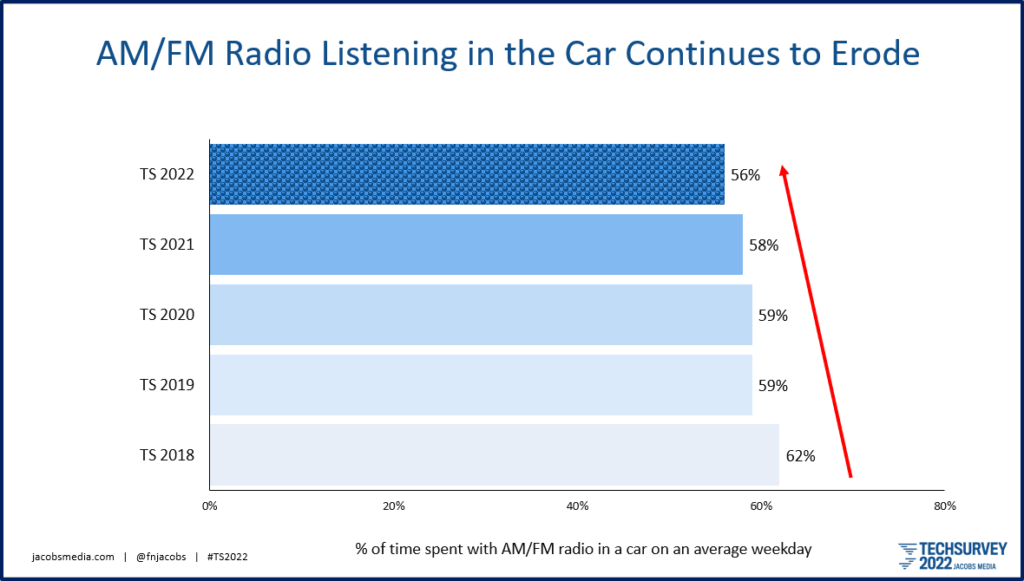
We have done considerable research on dashboard display over the past five years. First, there was that 3-market “audit” we conducted for the NAB. It found that radio station’s inconsistent displays made for a sketchy experience for drivers and passengers. Along with engineering whiz Glyn Walden, we wrote a DIY piece for the NAB – for both programmers and engineers. (You can access the updated version free on the NAB website).
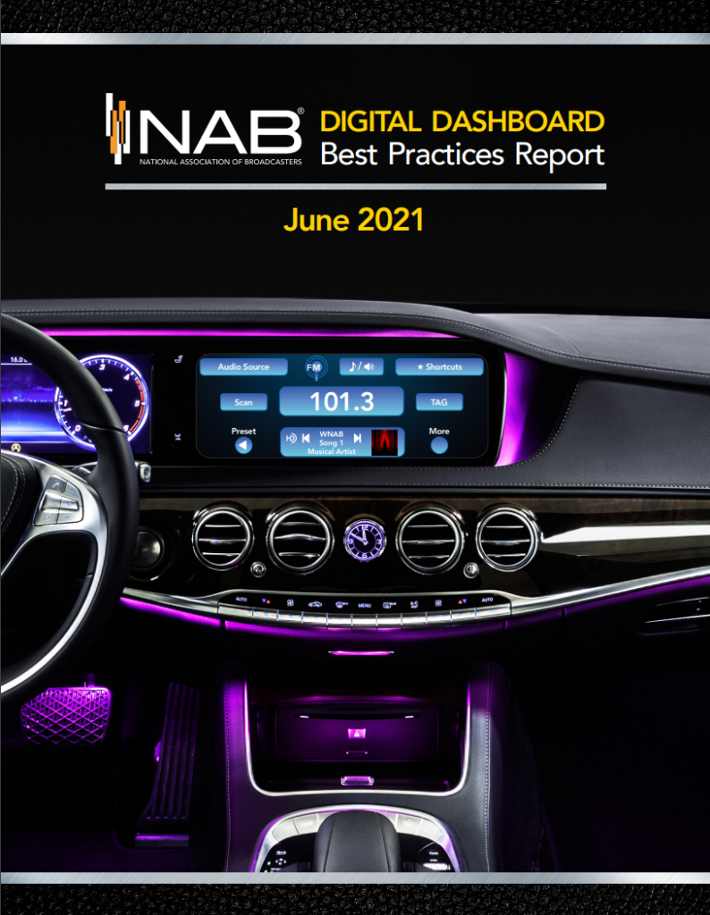 The idea is to provide a consistent, user-friendly, and appealing display from AM/FM radio stations that at least keeps up with other audio platforms in the car – Spotify, SiriusXM, Pandora, and the many other content providers. This matters because an increasing number of consumers are pairing their phones in their cars. Our new Techsurvey tells us eight in ten consumers can now connect a smartphone in their cars. And three in ten now own an in-dash infotainment system, like Ford SYNC.
The “connected car” isn’t just a nascent technology like it was when we met in Detroit for the first DASH Conference in 2013.
It’s here. Now.
Broadcast radio needs to keep up with these critical times, and not remain “a small step behind technology,” as the consultant I referred to earlier advocated.
But I’m not just opinionating about the “connected car” space and in-dash video screens. We’re doing our homework.
Last year, Jacobs Media conducted a series of one-on-one interviews for Quu, the company bringing a semblance of consistency, strategy, and sanity to radio’s in-dash experience through metadata.

We simulated a radio listening experience with myriad different messaging and graphic display approaches. The goal was to learn which ones are distracting, which are useful and positive, and which drivers ignore altogether.
As one respondent told us, artist and title information for music is now “table stakes” for radio, especially up against competing services that deliver great-looking displays.
Another enthusiastically told us album artwork (available via HD radio’s “Artist Experience” technology) is “a game-changer” for broadcast radio.
Do some people ignore the display altogether? You bet. They are concerned about distracted driving, and they report they never look at their car’s display. That includes call letters and frequency, too. Just as every vehicle and after-market infotainment/radio system is different, so are drivers themselves.
The best we can do is produce the most competitive and user-friendly system possible.
What we cannot do as an industry is to afford to fall further behind or take a “wait and see” stance about this technology. Radio has taken that go-nowhere road far too often over the past couple decades, almost always to its own detriment.
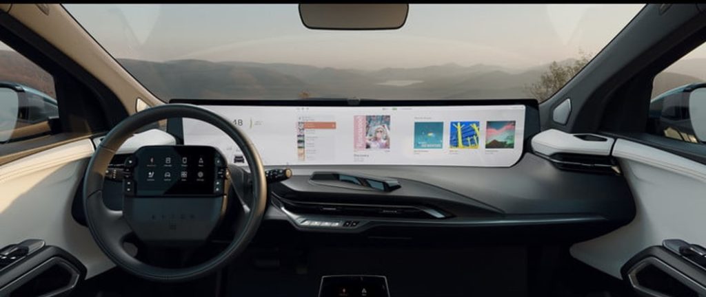
Dashboards are getting bigger and better, as you can see from the pillar-to-pillar screen in the Byton concept vehicle (pictured at the top of this post) we first saw at CES in 2020. Since then, more OEMs are designing dashboards with more screen “real estate,” making it incumbent on broadcast radio to look as good on these displays as possible.
CTA’s VP of Research, Steve Koenig, calls it the “screenfication” of the car. In the same way the visual element has become more important to a once-audio only medium like radio, visuals have made their way to the car. This February, Koenig explained this to Radio World:
“Radio broadcasters need to utilize that space, because a lot of others are. Streaming audio and other connected services coming into connected vehicles utilize that screen real estate for drivers and occupants.” He said this development spotlights the importance of the metadata carried by many broadcast and streaming signals.”
The bigger the screens (think how Tesla started iPad-sized screens, and now the other automakers are following suit), the greater the chance drivers might take their eyes off the road. But the National Highway Transportation Safety Administration, an independent government agency, notes that using a cell phone while driving represents the biggest impediment to safety:
“Texting is the most alarming distraction. Sending or reading a text takes your eyes off the road for 5 seconds.”
And wouldn’t you know it – April is Distracted Driving Awareness Month. The NHTSA says there’s a new issue impacting more and more drivers- anxiety.
 According to a news story by WXYZ-TV here in Detroit, stress is leading to more accidents. General Motors’ Tricia Morrow notes, “We really want to bring awareness to the fact that distractions can be more than texting. More than having a cheeseburger in your vehicle. Really, we need to be cognizant of our emotional state while we are out on the road.”
In a recent study by GM and the McCann World Group among 3,000 drivers in the U.S., 40% of participants feels more anxiety than they did pre-pandemic. In fact, a majority says there were times when they were crying in their cars; about a third had to pull over because they were overcome by emotion.
And you thought trying to find your favorite station on your connected car was stressful. To make it easier, connected car systems increasingly make extensive use of voice commands to control in-car media and other features. These systems aren’t perfect by any stretch of the imagination, but they have increasingly become safer.
So, I’m passionate about radio keeping pace with other media platforms, a campaign Paul and I have been spearheading since 2010. And it begs the question, what would be so bad about broadcast radio leading the way for in-dash technology and visuals?
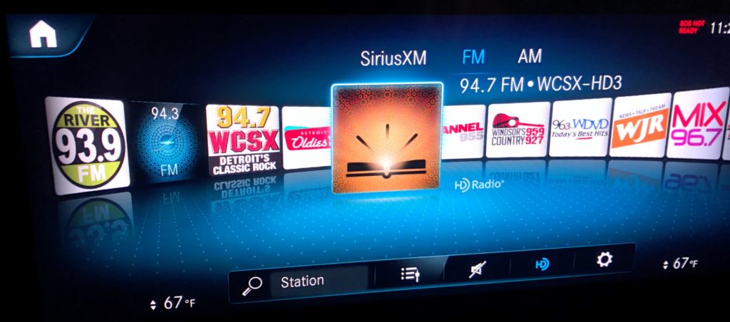
Don’t laugh. When you see Xperi’s AutoStage interface, you’ll want it in your next car. It makes the radio dial come alive. It might even stimulate drivers to sample what’s between 88 and 108 to see what’s under those colorful icons. When Paul took a Mercedes test drive here in Detroit, this is what he saw on the screen.
I want this in my next car, and hopefully, you do, too. As an industry, we should aspire rather than settle for the same-old-same-old. Is this distracting? Or is this a cool state of the art representation of variety in an American radio market:
Incidentally, these discussions about driver distraction are nothing new. Back in 1930, Massachusetts and the city of St. Louis were up in arms over driver distraction. Even back then, they were concerned new car technology was endangering drivers, causing accidents. Four years later, the Auto Club of New York surveyed drivers and found a majority shared this concern.
What technology was causing this kerfuffle over car safety and what we now know as “driver distraction?”
The car radio.
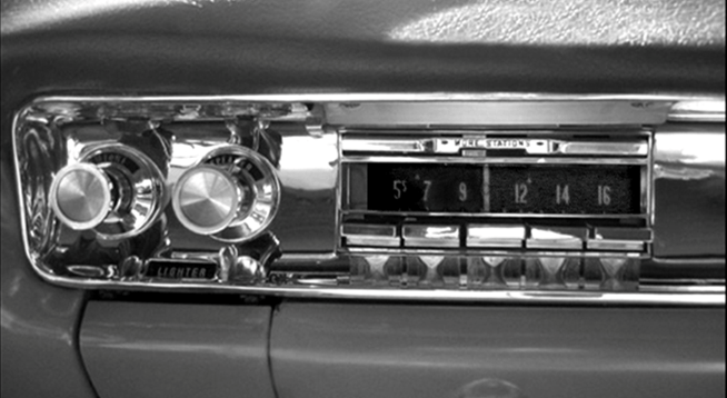 And a footnote: Back in the 1930’s, the Radio Manufacturers Association argued successfully that radio in cars “helped drivers avoid danger by cluing them into impending storms and by helping drivers remain alert, preventing them from falling asleep at the wheel.”
In time, car radios become smaller and easier to operate, thus making them safer to use while driving. All of us owe thanks to the RMA for making the case.
And the kicker: The Radio Manufacturers Association was the forerunner of the Consumer Technology Association – the organization that produces CES. As is their tradition, CTA consistently argues on the side of innovation – and so should radio broadcasting’s member organizations.
Radio was the original in-car medium. If we don’t get with the program, the writing’s on the wall.
Or better put, the display’s on the dash.
- Media And Technology In 2025: Believe It Or Not! - April 18, 2025
- In Radio, You Just Never Know - April 17, 2025
- The Secret To Making A Great Podcast (And Great Radio) - April 16, 2025



Great piece, Fred.
As a recent new car buyer. I’m so impressed with my Hyundai Ioniq hybrid, and it’s info-tainment system.
Its got Apple carplay and Android auto, so there’s that.
But it also has a “radio” button, and when you push it, it brings up your fave stations as well as a Sirius XM option. At least we’re on a level playing field!
(Call me if you’d like a demo).
[OH yeah, 55 Mpg too]
I would love to see a screen shot of your car. The displays are getting better technically. But do me this, JC: Do a slow scan of your market from 88 to 108 and see how everyone looks. Chances are, you’re going to see some gnarly-looking metadata. Thanks for chiming in.
OK Fred, you really hit a HOT button on this topic. Wish I could be at the NAB in Las Vegas, but financially it can’t work. Agree with just about everything you said. I’ve rented newer cars that have audio systems SO complex I’ve had to find a dealer to let me know HOW to operate the controls. As one with 44 radios in my house, I know how to work a radio! However, for those of us over the age of 50 or 60 it can really be a challenge. I am looking at a 2020 Lincoln MKZ which has AM, FM, HD and SXM that pulled in WGN-AM in Plymouth, MI from Chicago at noon! That sold me, but I’m easy to please. Honestly the future both excites me and scares the sh*t outta me. I’ll call it a FIBER attack!
I think a lot of us (especially in radio) see the future like you do, Art – alternatively thrilling and frightening. I’m driving a similar model Lincoln, and the improved SYNC system is pretty intuitive. You’ll find that SXM living right alongside AM and FM gives the satcaster dashboard real estate parity with your favorite Detroit stations. Let me know how you enjoy it.
Four years ago now I dropped my Sirius/XM subscription and went only with the 4000+ tracks on shuffle mode from my iPhone for in-car listening. I still hear tracks I haven’t heard in a long while, and I can always change/add to the library. Two years ago I got a car with Apple Play, and now Apple Music; and the music listening skies have parted. I have all the meta-data I need on the screen, Artist LP art, song title, what more do you need – LP liner notes are not appropriate for in-car reading. A radio station only needs to add their Call Letters and Freq. to that basic information and they are completely doing the service that they are there for. The look and format needs to be kind of “Billboard” simple; absorbed at a glance. The listener UX situation will eventually take care of itself, side from all that; What if radio stations started raising their ad rates while cutting the time of the commercial breaks they run? That has always been the biggest turn-off for me, and many others I presume; sitting through a mind-numbing 5 min.+ long commercial break – buh-by. That has always been the primary reason for “button punching” since the inception of AOR type formats with 3 to 7 songs in a row then a commercial stop. Seems as if the station that truly does deliver “More Music” with no longer than 3 min. breaks, :90 to-2 min. ideally (:30’s only, no more droning on and on :60’s), THAT would be ideal and truly a difference maker in this current terrestrial climate. AND if the books show no drop off in audience numbers and even show the anticipated growth in listener numbers because of the merciful short, but memorable breaks, then the station runs along, same-same on revenue generation but grows its listening audience (and with audience growth there might be room for a little rate hike…). It would take a bold station owner to be one of the first in any given market, but that could be the game-changing beginnings of a win-win. That would be something within the stations control that would actually grow their business, let their On-Air talent shine through (the real reason people tune in, the personalities), and make a radio station with a real “curated” identity again, something to actually seek out again, be a part of. Now, tell me how the Herb Tarlick’s of the b’cast radio world will argue thats not possible. Even though I didn’t make a long career out of Radio, I still care about it and still can’t stand it for the above long-break reasons. It’s as bad as trying to watch a movie on TBS (another thing I no longer do), you forget what you were watching/listening to. The subscription endless playlist music services are all nothing but commodities, they have the personality content of MUZAK, listeners get tired of the wallpaper after a while – however if you make room to entertain, and have fun with their interests they will come back for that.
PS. trust you’re doing well. Best, Jim
As a former radio guy, you know just enough to be
dangerouser…right! Your observations are (no pun intended) spot on. Radio broadcasters have let greed and adherence to “PPM best practices” create experiences that are often unlistenable. And in cars where no platform reigns supreme, it’s a level playing field. May the best experience win.And the best personalities, as you point out. That was always the secret sauce. Still is.
Great to hear from you, Jim.
In radio, Fred, we’re distracted by shiny objects constantly. The “dashboard” issue is important to the survival of broadcast radio since that’s an important way people get our product. The splashy graphics laden display in front of the driver can’t be healthy for anyone. On a busy freeway do I want to be distracted by the latest picture of Dua Lipa? The smiling face of Danny DJ? The graphic from the local pest control company? I think I want to watch the rest of the traffic to avoid the lamebrain on their phone drifting into my lane. The Tesla driver on autopilot drifting off to sleep. The #1 issue is highway safety, and the more broadcasters can do to enforce that the better. The challenge for broadcasters vs. Sirius or the streamers is to provide something that will engage the listener and then be the “go to” audio destination when they turn on the vehicle. That way drivers can do what they SHOULD do -pay attention to the number one reason they’re in the vehicle. To drive. Pretty graphics on the dashboard should, for the safety of all of us, be priority #3. Driving safely – #1. Audio engagement- #2. Pretty Graphics- #3.