Once upon a time, radio stations only needed to worry about the size of their audience to cater to their clients. But in the information age, advertisers increasingly want data about the people they are reaching. Today, every radio station should be building a listener database that includes contact information and key data points, such as age, gender, zip code, etc. Gathering this first-party data will only become more important as third-party cookies are phased out.
How do you gather this data? Through online forms. Here’s a list of places on your website where you should have forms for listeners to fill out.
The more people who fill out your forms, the more data you’ll have on your listeners, and the easier time your sales team will have closing deals. So I want to dig into one of the nitty gritty details that will result in more listeners completing your online forms: selection options.
When you want to ask people to select an option from a list on your form, you have three options: A dropdown list, a checklist, or a radio button. Let’s talk about when to use each of them:
1. Checklists
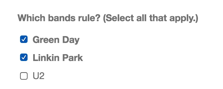
 A checklist appears as a list of choices. Use it when you want people to have the ability to select multiple options. For example, if the question is, “Which states have you lived in?,” a checklist will allow people to select every state that they have lived in. By contrast, dropdown menus and radio buttons do not allow you to select multiple options.
Make sure that you put the choices in a logical order, such as alphabetical, chronological, or by size. This makes it easy for people to find the answers that are most appropriate.
2. Dropdown Lists
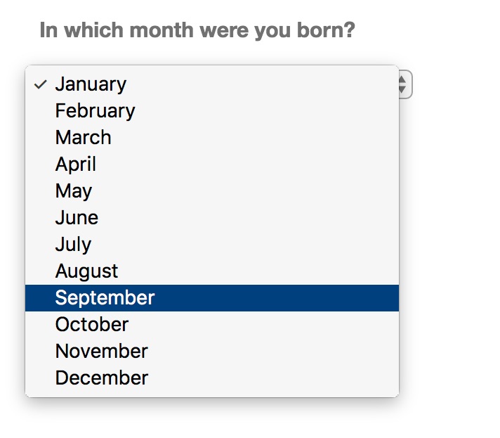
 A dropdown list only allows you to see one option until you click on it; then it reveals all of the available options. Because it takes work to see all of the options, you only want to use a dropdown menu when people don’t have to think about the right answer. For example, if I asked you what state you live in, you know the answer immediately. However, if I asked you what industry you work in, you would have to review all of the choices (Radio? Broadcasting? Media? Entertainment?) to select the best one. This is more cumbersome than selecting your state, so in this case you would want to use a Radio Button.
3. Radio Buttons
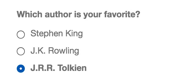
 Like a checklist, a radio button displays all of the possible answers without needing to click on anything more to see them. Unlike a checklist, however, the radio button only allows the person to select one option. Use it when people need to see the entire list of choices before selecting a single answer. Like your checklists, make sure that the answer options appear in a logical order.
Also, be sure that all of your options are mutually exclusive. For example, if you ask, “What industry do you work in?” and the answers include both “Sports” and “Media” as an option, which one should somebody who works at a sports radio station choose?
When you have a pair of options to choose from, such as Yes/No or True/False, you can use either a dropdown list or a radio button.
 These details might seem minor, but over time they can have a large impact on the number of people who complete your online forms, which can in turn affect your bottom line. There is an art to creating an online form that generates a lot of completions. To learn more, I highly recommend reading Forms That Work: Designing Web Forms for Usability by Caroline Jarrett and Gerry Gaffney.
- A Simple Digital Treat to Thank Your Radio Listeners This Thanksgiving - November 13, 2023
- Interview Questions When Hiring Your Radio Station’s Next Digital Marketing Manager - November 6, 2023
- A Radio Conversation with ChatGPT: Part 2 – Promotions - October 30, 2023


Good advice. Might want to restrict radio buttons’ list to just as many as will fit without scrolling.