 When listeners come to your radio station’s website, what do you want them to do? Do you want them to stream the station? Sign up for the email newsletter? Enter a contest? Purchase tickets to a station event? It’s important to know the goals of your website.
Once you’ve determined these goals, you’ll want to create clear “calls to action” on the site to encourage people to do these things. A call to action is usually a link that takes people where you want them to go, such as a button that says “Listen Now” that allows people to stream the station. Here are some ways to improve the calls to action on your radio station’s website:
1. Know Which Calls to Action Are Important
Too often, radio station websites homepages are overloaded with stuff. What’s worse, all of this stuff is given equal weight. The truth is, some actions that listeners can take on your website are far more valuable than others. If they stream the station, that could increase ratings and impact the station’s bottom line. If they peruse the station’s photo gallery, that’s not nearly as valuable. The website should layout ought to prioritize the calls to action that are most valuable, and de-emphasize or remove links to less valuable actions.
2. Give Them Prime Real Estate
Your most important calls to action should be given the best spots on your website. Studies shows that people’s eyes move across websites in an “F” pattern. First, they scan the top of the site from left to right. Then, they scan from left to right again below the first pass. Finally, they scan down the left side of the page.
This means the most important spot on your website is the top left corner. This is where you want to put the station logo so people know what the website is all about. The second most important spot on your radio station’s website is the top right corner. Don’t waste this space on something trivial like a weather report. Put your most important call to action — such as a “Listen Now” button — here.
The sidebar is also valuable real estate. Put other calls to action here in order of importance. Remove anything that isn’t an important call to action from the sidebar. Less is more.
Keep in mind, the layout of the mobile version of your website is different — people simply scroll from top to bottom. This may change the value of the real estate. For example, if your mobile website moves the sidebar to the bottom of the page, this location may not be as effective for calls to action as it is on the desktop version of the site.
3. Give Them Some Space
Instead of cramming calls to action up against other elements of your website, set them apart with some whitespace. A buffer indicates that an action is important and draws attention to it.
4. Make Buttons Look Like Buttons
From time to time, I’ll come across a call to action that looks more like an ad than a button. It’s often an image with some overlaid text. In some cases, it’s not immediately obvious that this is a clickable link. Make sure that your most important calls to action look like buttons so that it’s clear to listeners that can click on them.
5. Set Them Off with Color
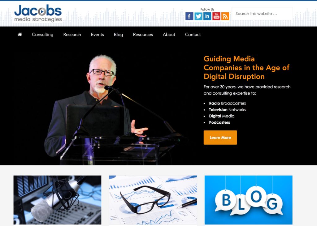
To attract attention to a call to action, use button colors that contrast with the rest of your radio station’s site. For example, the dominant colors on our website are blue and grey. When a call to action is really important — in our case, usually when it leads to a page where we ask people for their email address — we create an orange button. For links that are less important, we’ll use a blue button or just linked text.

6. Use a Strong Verb
Use a short phrase that starts with a strong verb as the text for your button. For example:
- “Listen Now”
- “Enter to Win”
- “Sign Up”
- “Get Details”
7. Set Clear Expectations
Make sure that people know exactly what is going to happen when they click on a link. In some cases, the text on the button will be enough to convey this information (ex: “Listen Now). In other cases, you will want to include supporting text above the call to action. For example, if you are asking people to sign up for an email list, tell them exactly what you will send them and how often they can expect to receive emails. (Ex: “Get our concert listing in your email inbox every week.”)
Taking a few moments to strengthen your website’s calls to action can dramatically improve its performance and can have a noticeable effect on your radio station’s overall digital strategy.
- A Simple Digital Treat to Thank Your Radio Listeners This Thanksgiving - November 13, 2023
- Interview Questions When Hiring Your Radio Station’s Next Digital Marketing Manager - November 6, 2023
- A Radio Conversation with ChatGPT: Part 2 – Promotions - October 30, 2023


Leave a Reply