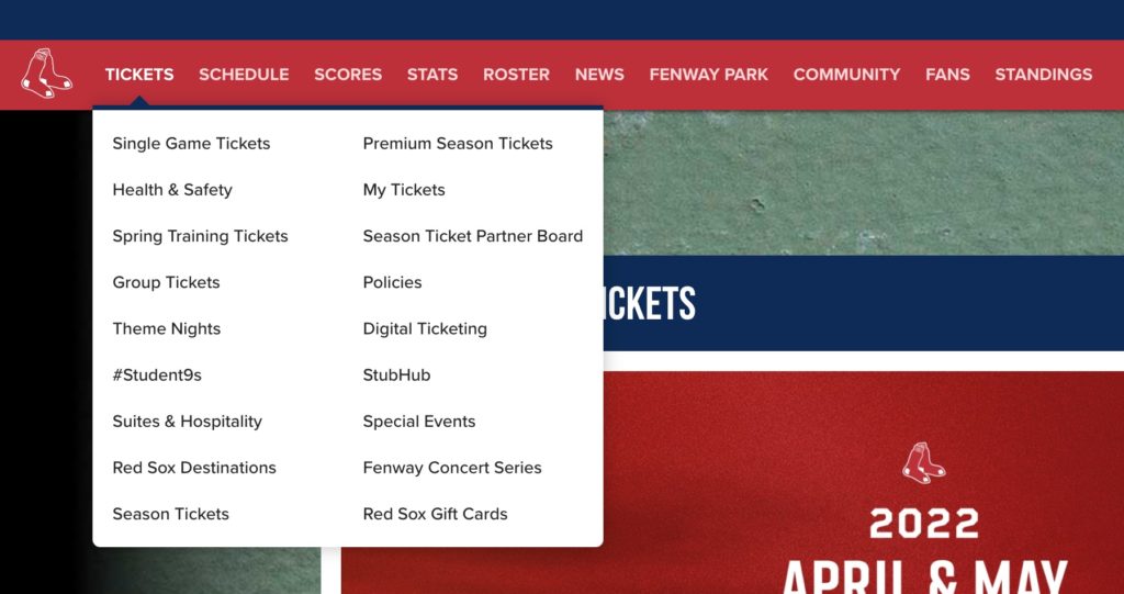
…while we’re on the topic of things that Major League Baseball does wrong, let’s discuss website sub-menus. Sub-menus are the links that pop up when hover your cursor above a menu item. Here’s an example from the Boston Red Sox website:

Sub-menus can seem like a good idea for the web designer who’s trying to find a place to put everything, but when they get bloated, they can be a horrendous experience for the website visitor. In this case, I have moved my mouse cursor over the “Tickets” link. When I do that, I am sending a clear message to the Red Sox: “I want to give you money.” At this point, the job of the Red Sox website is to make it as easy as possible for me to give them money.
Unfortunately, they stop me dead in my tracks by presenting 18 (!) sub-menu items that I now need to consider before whipping out my credit card. Suddenly, I find myself asking all sorts of questions: If I want to take my whole family to a gam, do I click on “Single Game Tickets” or “Group Tickets”? If I want to buy my tickets online, do I click “Digital Ticketing,” or “StubHub”? Are “Theme Nights” also “Special Events”? And what the heck are “#Student9s”?
This is a terribly confusing sub-menu. At the very least, it’s frustrating Red Sox fans. At worst, it’s causing the Red Sox to lose thousands of dollars in revenue.
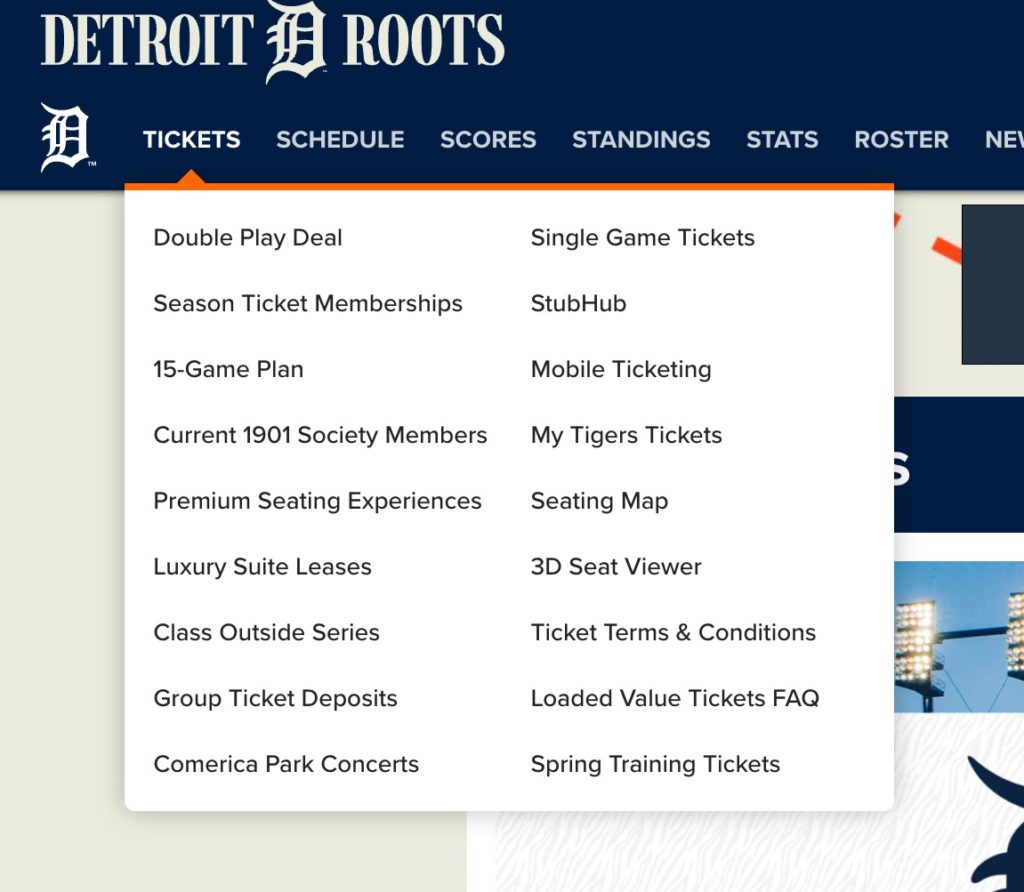
To be fair to the Red Sox, this is owned by Major League Baseball, so all of the teams’ pages suffer from the same problem. Here’s the sub-menu for the “Tickets” link on the Detroit Tigers (or did the team change its name to the “Detroit Roots”?!) website:

 When a sub-menu contains too many links, it’s usually because the designer subscribes to a mistaken philosophy: The fewer clicks it takes to get to a page, the better. As Steve Krug points out in his excellent book on website design, Don’t Make Me Think, this is a misnomer. As he has discovered during years of running usability tests on websites, it does not make a big difference whether it takes two click or four for a visitor to reach their desired destination.
The most important thing is that they feel confident that they are moving in the right direction. As you can see with the Red Sox website, the large number of sub-menu items has decreased my confidence that I am navigating towards my desired destination.
The problem with sub-menus is that you can’t convey much information with them. This is particularly problematic for casual fans who are visiting the website for the first time. If I don’t know what the Detroit Tigers’ “Class Outside Series” is — and I don’t — the sub-menu provides me with no information. Instead, I’m just going to ignore the thing that’s unfamiliar to me, so I’ll never find out what the “Class Outside Series” is.
There are a few places where radio station websites commonly use sub-menus. A radio station might have a main menu item labeled, “DJs,” and hovering over it reveals a sub-menu with links to pages for all of the airstaff members. The “Events” link often contains a sub-menu listing different types of events. And, of course, just about every radio station website has a catch-all link in the menu where the designer shoved all the links that didn’t neatly fit anywhere else. This catch-all link is usually labeled with a word like “Connect.” (Admittedly, our website has a catch-all link in the main menu, too; it’s labeled “Resources.”)
How many sub-menu items is too many? There’s no hard and fast rule, but in general, fewer is better. So let’s look at a way to decrease the number of sub-menu items.
Often, it’s better to reduce or eliminate sub-menu items by creating a Path Split webpage which sits between the main menu and the visitors’ final destination. Think of these pages as forks in the road. It’s easier for the visitor when there are more forks in the road, each with fewer choices, than when there is one fork in the road with an overwhelming number of options. In other words, instead of presenting the visitor with a path that splits once into nine different directions, we can use these pages to split the path three times into three options each.
In the case of the Detroit Tigers, they could create a sub-menu item called “Regular Season Tickets.” This would link to a webpage that includes a list of options, including Single Game Tickets, Double Play Deal, Season Ticket Memberships, Luxury Suite Leases, etc. — with a brief description of each choice. The additional information will make me feel confident that I am moving towards the correct destination.

Better yet, the Detroit Tigers could use even more forks in the roads. When deciding how many forks to put in the road, it’s helpful to draw a decision tree. The key to a decision tree is that it only asks one question at a time. Each question presents a fork in the road, and requires a new Path Split webpage. Here’s are the questions that the Tigers might want to ask:
- Do you want to attend a pre-season game or a regular season game?
- Do you want to buy tickets for one game or multiple games?
- Where do you want to sit: regular seating, premium seating, or a luxury box?
By eliminating the sub-menus and using Path Split pages instead, we can turn one overwhelming decision into three easy decisions, and improve the user experience.
Path Split pages can take many forms. For example, a click on “Events” can take the visitor to a page with an Event Calendar featuring concerts, street team stops, and community events. This calendar could have a filter which allows the visitor to select the type of events that they want to see.
Take a moment to look at your website’s sub-menus and ask yourself if the user experience would be improved by using Path Split pages. In particular, focus on the decisions you are asking your visitors to make when they are presented with a sub-menu. Are they being asked multiple questions at once? Does the sub-menu give the visitor enough information to confidently make a decision? With a few small tweaks, you can probably build a better website menu than Major League Baseball.
- A Simple Digital Treat to Thank Your Radio Listeners This Thanksgiving - November 13, 2023
- Interview Questions When Hiring Your Radio Station’s Next Digital Marketing Manager - November 6, 2023
- A Radio Conversation with ChatGPT: Part 2 – Promotions - October 30, 2023


Leave a Reply