I look at a lot of radio station websites, and I am constantly surprised by how many of them give prime real estate in the sidebars to things that don’t further the station’s digital goals. Worse yet, some of the items in the sidebar send people away from the radio station’s website! Don’t make these mistakes. Here’s a closer look at what your radio station should include in its sidebars…
The Sidebar: Desktop vs. Mobile
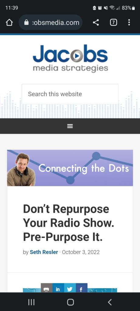
The sidebar is an extremely important component of the desktop version of your radio station’s website. It become less important on the mobile version of your site because if you’re using a mobile-responsive website, it will probably get pushed farther down the page to collapse the site into a single column for smartphones.
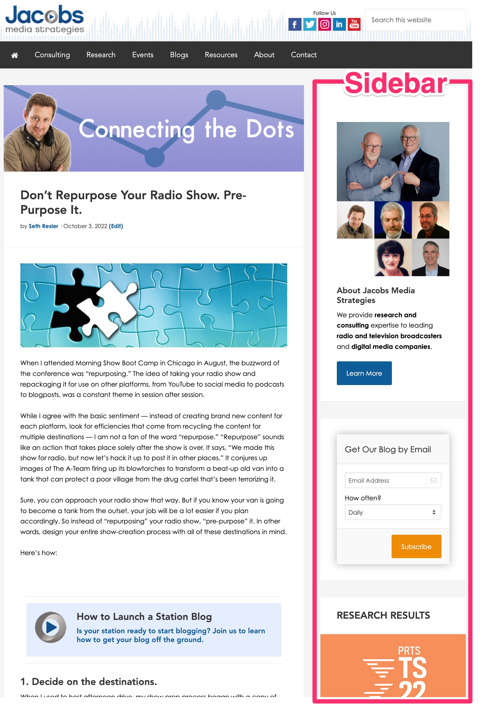
Here’s what the sidebar looks like on the desktop version of our site:
For comparison, here’s what the same page looks like on a smartphone. As you can see, the sidebar gets pushed to the bottom of the page, and a visitor has to scroll all the way to the bottom to see it (which they are less likely to do):
What Goes In The Sidebar
Before we started building our website, we first laid out our digital goals. For Jacobs Media, we decided the most important goals of our website were (1) to explain to potential clients what we do, and (2) to build our email list. Your radio station’s website may have several goals, including getting people to stream the station, sign up for the email list, enter a contest, etc.
So what is the goal of the sidebar? Things that directly accomplish one of our website’s goals.
The first item in the sidebar on our website is a link to the About Us page. The reason we have given this top spot in the sidebar to this link is because it accomplishes the first goal of our website; it explains to potential clients who we are and what we do.

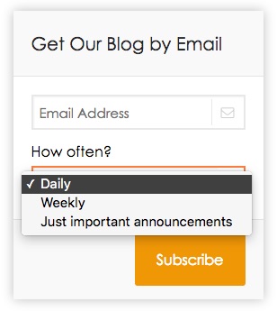
The second item in our sidebar asks people for their email address, which accomplishes our second digital goal. Sometimes, all you have to do to get people to give you their email address is ask. However, it is important to explain to them exactly what they will get in return. Notice how we clearly indicate what we will be sending them (Fred’s blog) and how often they can expect to receive emails from us. In fact, we give people a choice — they can receive the blog daily or weekly.
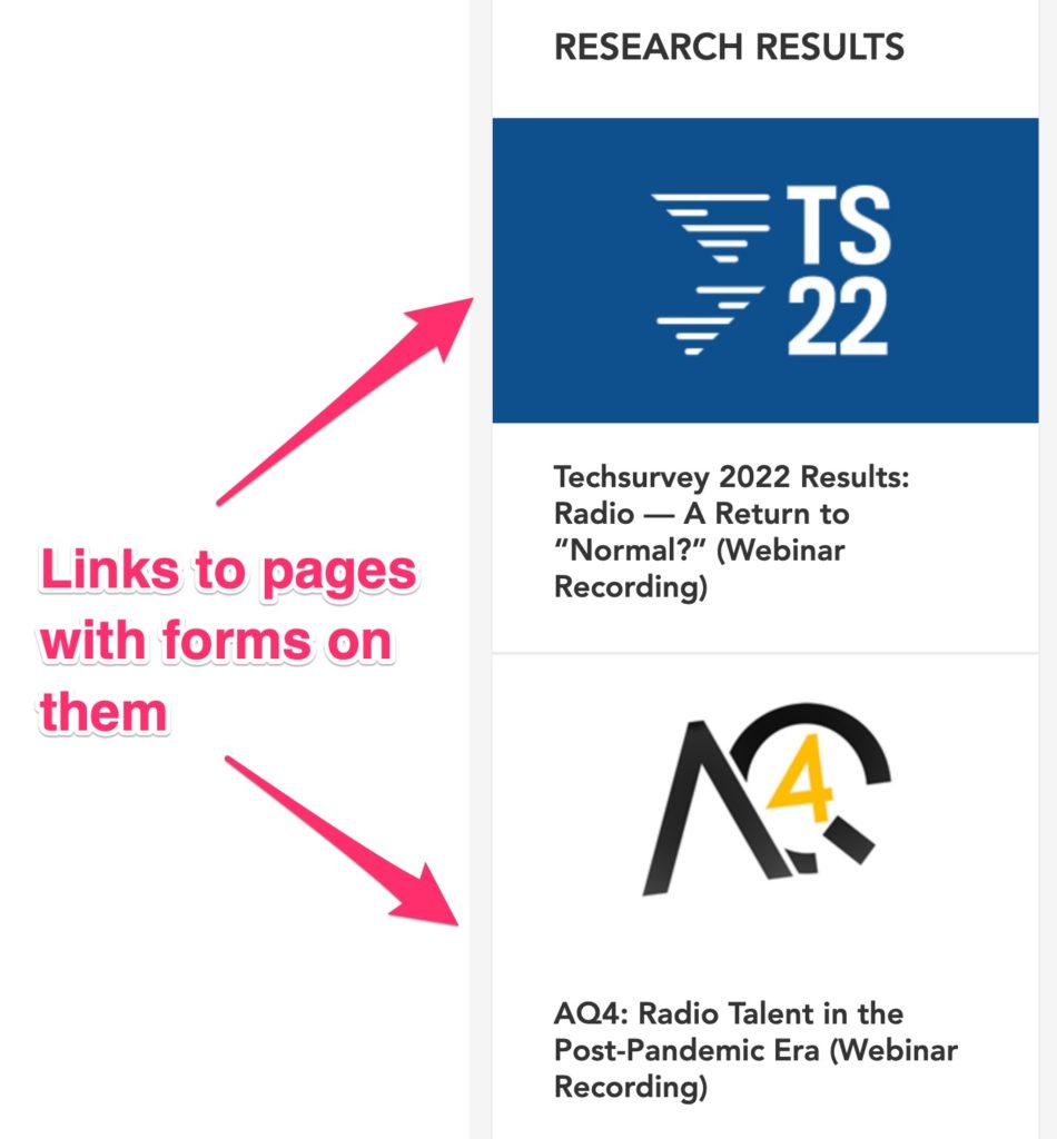
Every other item in the sidebar — Research Results, Guide & Tools, and Webinar Recordings — links to a piece of content that is only accessible if you fill out a form giving us your email address. (If you’re on a smartphone, we’ll only ask for your email address before allowing you to access the content; if you’re on a desktop, you will need to fill out a longer form.)
What to Leave Out of the Sidebar
Once people come to our website, we want them to do certain things, such as sign up for our email list. To maximize the number of people who do this, we remove all of the other options. Take note of what we do not include in our sidebar:
- Our Latest Blogposts: The point of the blog is to create content that attracts people to the site from somewhere else, such as Facebook, Twitter, Google, or an email. Once people are on the site, we don’t want to send them to another blogpost. Instead, we want to send them to a page with a form so we can capture their contact info. This way, we can email them new blogposts on a regular basis, encouraging them to return to the site multiple times. If we send them to another blogpost and then they leave without giving us their email address, there’s an increased risk that they will be a one-time visitor. But if we capture their email address, we increase the chances of turning them into a repeat visitor.
- Our Latest Social Media Posts: Many sites put a “Latest Tweets” or “Latest Facebook Posts” widget in their sidebar. This wastes valuable real estate in the sidebar, and can drive down the number of goal conversions your website produces. You want to drive people from social media to your website, where they can accomplish one of your digital goals. Once they’re on your website, you don’t want to send them back to a social network without accomplishing one of your goals. Don’t put a social media widget in your sidebar.
- The Weather: People have better ways to find out what the weather is than going to your radio station’s website.
- Social Media Widgets: Your goal is to get people to come to your website from sites like Facebook and Instagram. The last thing you want to do is send them back to those social networks. It’s fine to put links to your social media accounts in the header, footer, or main menu; but don’t give a widget that displays your latest posts prime real estate in your sidebar.
What Should Your Radio Station Put in the Sidebar?
The short answer is this: Feature items that directly encourage visitors to accomplish one of your digital goals in the sidebar. Leave out anything that does not directly lead to the completion of one of your digital goals. As you can see, this is why it’s so important to know the goals of your station’s website.
Let’s assume that the goals of your website are to get visitors to:
- Stream the station.
- Join the email club.
- Enter a contest.
- Click on an ad.
You may decide to skip your first goal in the sidebar if you’ve already put your “Stream Live” button in the top right corner of your website header. Instead, you’l start with the second goal: Use a box that asks people to sign up for your station’s email club. Be sure to tell them what you’ll be emailing them and how often they can expect to receive emails. In short, what’s in it for them?
Beneath that, you can include a generic link to the Contests page. Even better, include a link to each of the contests that are currently running; this decreases the number of clicks the visitor needs to make before giving you their email address.
You can also put an ad in your sidebar if it contributes to the station’s bottom line.
What else? If these are your station’s only four digital goals, then nothing. Quit while you’re ahead. If you have additional digital goals, such as encouraging visitors to click on an advertisement, then add that to the sidebar. But don’t fill the sidebar with extra stuff just to fill space. You’ll increase your website’s goal conversion rate by providing less options, not more.
Your website’s sidebar is a powerful part of your radio station’s overall digital strategy. Be sure to think carefully about how you use it.
- A Simple Digital Treat to Thank Your Radio Listeners This Thanksgiving - November 13, 2023
- Interview Questions When Hiring Your Radio Station’s Next Digital Marketing Manager - November 6, 2023
- A Radio Conversation with ChatGPT: Part 2 – Promotions - October 30, 2023


Thanks for this, Seth! Good stuff, simple, to the point.
Thanks for reading, Tim!