This week, I’ll publish the first episode of season five of the Worldwide Radio Summit podcast. It’s a conversation that I had with Julie Talbott, the President of Premiere Networks, that was recorded at the conference in the spring. Towards the end of the interview, we discussed the Broadcasters Foundation of America, a fantastic organization that she is involved with which assists broadcasters facing financial hardship.
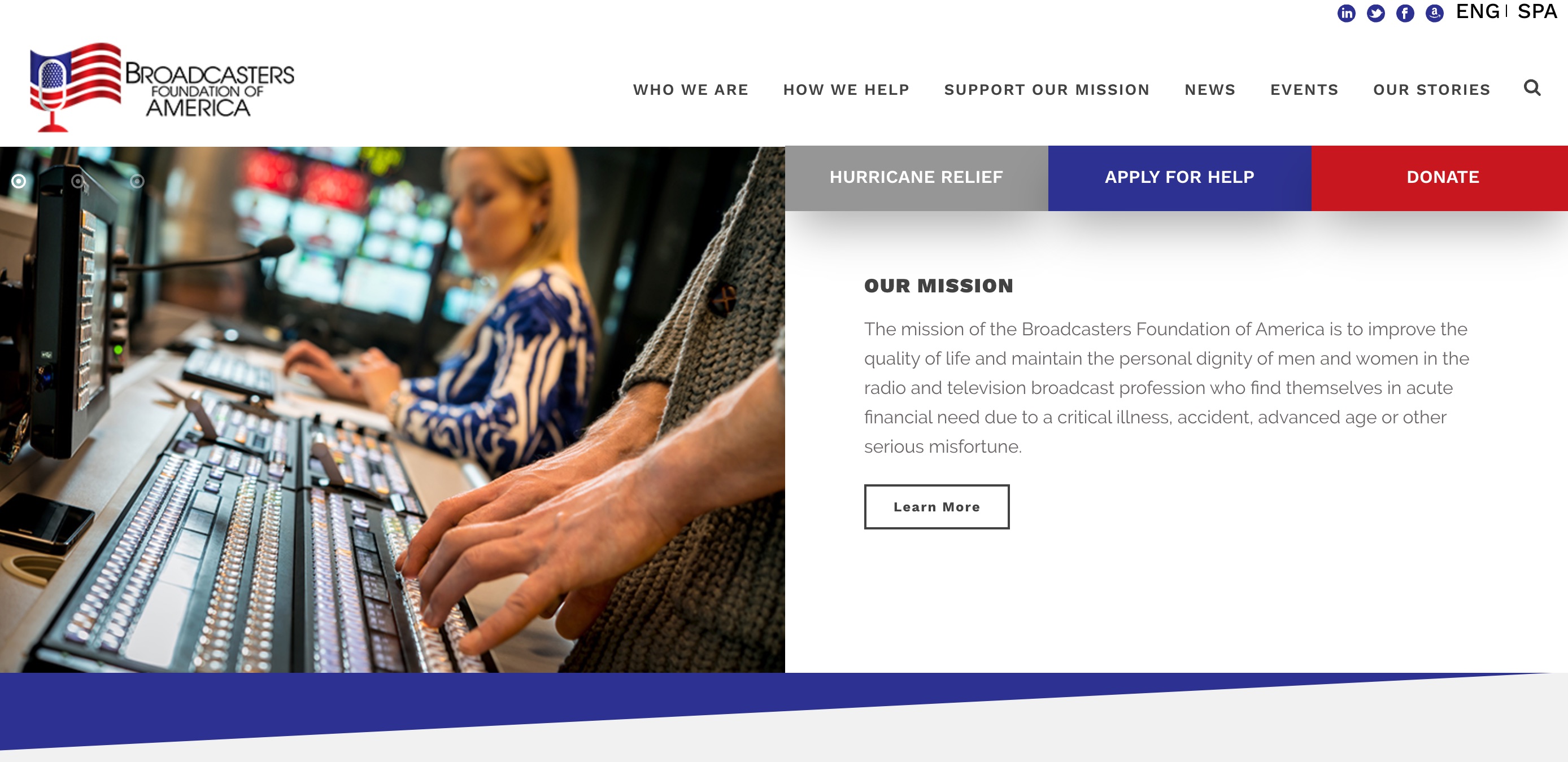
As I prepared to publish the interview, I looked up the foundation’s website, and I was very impressed by what I found. From a design and usability standpoint, this is one of the best broadcasting websites I’ve seen. Here’s why:
1. It’s clean.
In my role as a digital consultant, I see a lot of radio station websites with homepages that are overstuffed, as if every single thing the station does is equally worthy of being right up front. In fact, some things are more important than others, and only the most important information should be on the homepage. The Broadcasters Foundation demonstrates this nicely: if you want to know more about the staff or things the organization has done recently, you can navigate to those, but all that’s secondary to the organization’s mission, which is front and center on the homepage.
I am not a fan of slideshows on homepages, but the Broadcasters Foundation avoids the most common pitfall of this feature: It is not using the slideshow to settle disputes among the staff. Too often, radio stations use slides as a means of appeasing staff members who want their projects on the homepage. As a result, the website’s most valuable real estate becomes a mish-mash of Dunkin’ Donuts promotions, morning show stunts, and C-level bands with upcoming concerts. These things are not worthy of this space.
The Broadcasters Foundation could have done the same thing, using the slideshow to showcase its latest hire or last month’s fundraising event, but it doesn’t. Instead, the foundation does it right: It uses its most important space to send its most important message with slides that are permanent fixtures.
2. I immediately know what they do.
Speaking of the mission, I love that it is clearly stated in a single sentence on the most prominent piece of screen real estate. With a glance, I immediately know what this organization is all about. This is a sharp contrast to many radio station websites, where I often struggle to figure out what kind of music they play, what city they’re located in, and, in some cases, that they’re a radio station and not a celebrity gossip site.

3. The primary calls to action are obvious.
When I talk to radio stations about their digital strategies, the first question I ask is, “When people come to your website, what do you want them to do?” Many stations haven’t given any thought to that question, and the design of their sites reflect that; the primary calls to action are buried.
By contrast, it looks like the Broadcasters Foundation knows exactly what it wants people to do when they come to its site, because the primary calls to action are called out in big bold colors: They want people to “Apply for Help” or “Donate.” There’s a third call to action, “Hurricane Relief,” which may not be a permanent fixture on the homepage but makes a lot of sense in the wake of Dorian. Notice how these calls to action are set apart on the screen through the use of color, space, and direct language. Plus, they’re repeated in the website’s footer, so if you scroll down, they’re still on the screen.
Radio stations should follow suit, first figuring out what their primary calls to action are — for example, “Listen Now,” “Join the Email Club,” and “Advertise with Us” — and making those dominant on the homepage.
4. The language in the main navigation is clear.
As I scan the main navigation, I know exactly what I’ll get when I click on each item:
- Who We Are
- How We Help
- Support Our Mission
- News
- Events
- Our Stories
 Radio stations, on the other hand, sometimes use confusing language in their main navigation. For example, they might say “On Air,” when what they really mean is “DJs” (after all, the music, commercials, and shows are all “on air”). Or radio stations will use branded language that will be unfamiliar to people who are not regular listeners. For example, a station might say “Hot Club” instead of “Email Newsletter.” Finally, notice that the main navigation on the Broadcasters Foundation website does not have a “catch-all” item where it stuck all of the pages that didn’t fit under the other headings. (Even our website has a “catch-all” in the main navigation: “Resources.”)
Kudos to the Broadcasters Foundation for not only serving an important mission, but for having a fantastic website to boot! If you’re a broadcaster, pleaser consider supporting their fine work.
- A Simple Digital Treat to Thank Your Radio Listeners This Thanksgiving - November 13, 2023
- Interview Questions When Hiring Your Radio Station’s Next Digital Marketing Manager - November 6, 2023
- A Radio Conversation with ChatGPT: Part 2 – Promotions - October 30, 2023


Leave a Reply