I’ve devoted a lot of time in this column discussing the importance of choosing the right words for your website. Whether it’s making sure that you’re using clear terms in your website’s main menu or conducting a website usability test to make sure that the site’s verbiage isn’t causing consternation, it’s important to choose your words wisely.
But selecting the right images can be equally important. Pictures play a huge role in communicating to visitors what a website is all about. What are the pictures on your radio station’s website saying — both to listeners who are already familiar with your station as well as people who don’t know the station but stumbled onto your website by clicking a link on social media?
There’s a fun exercise that will help you take a look at your website with a fresh pair of eyes, focusing solely on what the images say about your station: Use Google Translate to view your website in a language you don’t understand. Here’s how you do it:
- Go to https://translate.google.com/ and enter your website URL in the box on the left.
- In the box on the right, select a language to translate the website into.
- Click on the link in the box on the right to open up your translated website.
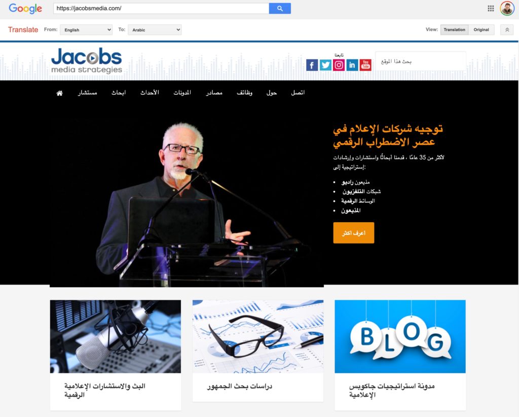
 I translated our website into Arabic because I speak a little bit of Spanish. Plus, I am completely unfamiliar with the Arabic alphabet, so my brain couldn’t begin to decipher the words if it tried. This forces me to judge the website by the images alone. Here’s what our website homepage looks like when translated:

Removing my ability to read the words really brings the images to the forefront. Does this webpage convey “radio”? Does it convey “research”? Perhaps the images could also be interpreted to mean something else, such as “audio mixing” or “business forecasts.”
Once you’ve translated your webpage, ask yourself a series of questions:
- Can I tell that this is a radio station website?
- Can I figure out what type of music this radio station plays?
- Can I identify core artists that I would expect to hear on this station?
- Can I figure out how to listen to the station?
- What is the overall mood or tone of the station?
Click through to different pages on your website and see if you can tell what each page is about without the words. Can you tell that the “Contests” page is about contests or that the “Advertise” page is for potential advertisers?
This quick little exercise can reveal any number insights about the images on your website, but here are two issues that it frequently uncovers:
1. The website doesn’t reflect our current reality.
These days, many of us are limiting our ventures out of the house to essential trips to places like the grocery store. When we do go out, we wear face masks. Does your website look out of tune with what’s happening in the world? Are you displaying anachronistic photos of concertgoers and street team appearances? What impact does this have on visitors?
2. The website doesn’t look local.
This issue can arise not just on radio station websites, but also corporate sites designed to attract advertisers. Often, the words on the page boast about local connections, but the images don’t match. By just looking at the images, can you tell where the radio station is located? Does the site feature local landmarks, or does it use obvious stock photography?
Once you’ve spent some time looking at your website in a foreign language, ask some of your colleagues to do the same. A salesperson may notice something different than a DJ, so ask a variety of people from the station. Based on the feedback you get, you may want to swap out some of your images.
- A Simple Digital Treat to Thank Your Radio Listeners This Thanksgiving - November 13, 2023
- Interview Questions When Hiring Your Radio Station’s Next Digital Marketing Manager - November 6, 2023
- A Radio Conversation with ChatGPT: Part 2 – Promotions - October 30, 2023


Leave a Reply