How recognizable is your station logo?
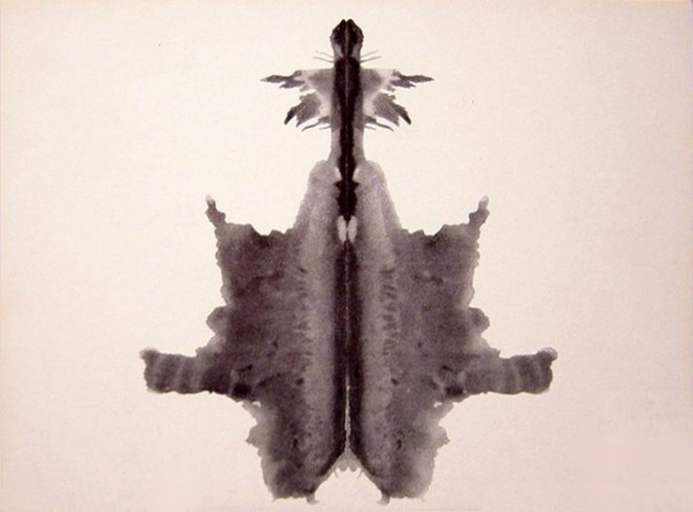
Like a Rorschach inkblot test, could your audience recognize your station by just looking at the outline or colors of your logo?
Logo design and brand strength are always conversation starters in marketing circles. To that end, The Atlantic recently profiled what is becoming a branding trend: logos without words.
That’s right. We’re talking about just a handful of brands whose shapes, colors, or basic logo shapes have become so ubiquitous and familiar, there’s simply no need for words.
And for many of these brands, they’ve been systematically shaving words and even image details in an effort to take the most minimalist of approaches to their logo designs. Sometimes, this is a process that goes on for years. But when you study logos, you can most definitely see the trajectory.
Take Starbucks for example:

From four words to two words to no words across four decades. Note also how they’ve settled in on that single green color.
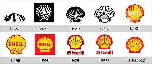
Here’s another example:

It’s interesting that Shell Oil started out wordless, incorporated their name in the late 1940s, but have now moved wholeheartedly to the wordless trend.
And it’s happened before in radio, too, and I was a part of one memorable example. In 1980, I was the research guy for the ABC Owned & Operated FM stations. All seven FM stations (that was the limit back then, and only one FM per market) used a variation on what was known at ABC Radio as the “racetrack logo.”
Los Angeles GM, Bill Sommers, was interested in learning just how well the shape itself – minus the “KLOS 95½” – still got the point across. So we mocked up the blanked out logo you see on the right and fielded a series of focus groups:

In all four groups, I held up the blank logo and asked respondents what first came to mind. And without hesitation, each group enthusiastically shouted out “KLOS!” – P1s and P2s, men and women, upper and lower demos. At the time, Frazier Smith was making waves as the station's cutting edge morning man whose catch phrase was “Too Hip.” Shortly after these groups were conducted, KLOS wasted no time in putting out “Too Hip” stickers – without their call letters. Suffice it to say, it was a bit radical at that time but we knew from our research that it would be effective. It was the market's little secret – except everyone knew.
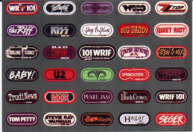
I brought the idea back to WRIF where afternoon drive legend Arthur Penhallow was popularizing “BABY!” As soon as those bumper stickers could be printed, they hit the streets of Detroit – by storm. We distributed thousands over the next many years, a very cool way to gain visibility, brand strength, and in a very non-marketing-esque way.
Both KLOS and WRIF seized the concept, and for decades, all sorts of different variations and permutations were produced, mostly around core artist concert tours, but also celebrating area sports teams and other events.

It's impossible to overemphasize the power of a great, lasting, and memorable logo. It’s part of the way heritage stations stay top-of-mind in their markets. As you look at the evolution of Starbucks, McDonald’s, Shell, and other brands that have evolved their logos while staying true to them, you appreciate what it means to have a strong visual representation that is indelibly etched in the minds of your audience.
Among other things, it makes your marketing dollars go further. Billboards, direct mail pieces, and digital messaging are automatically more effective because your stations are recognized.
For some stations, developing a logo that literally stands the test of time is a tall order. But for others that have a distinctive look and a healthy history of maintaining consistency, there are advantages. And given all the new format startups that occur seemingly every day in radio, taking the time to think through the logo design and its long-term impact is smart planning.
It starts with owning a shape, a color, or a visual representation. And it requires consistency – staying the course and marketing that logo – in order to reap the benefits. In an over-cluttered world, a great logo isn't the only thing, but when the rest of the brand is healthy, it can be a difference-maker.
I can tell you that no one working at WRIF back in the late ‘60s could have imagined the station would still be on the air and in the same format 50 years later.
But it can happen. And when the logo works as an asset, reaping the benefits of a great brand makes it that much sweeter.
By the way, I see a radio tower in the inkblot at the top of this post.
What do YOU see?
- Three Stories From The Techsurvey Trenches - April 23, 2024
- Today's Song Lyrics: Getting Dumb And Dumber? - April 22, 2024
- Get Your Free Radio Ads? Take It To the Bank! - April 19, 2024


I see the Silence of the Lambs death moth atop a bearskin rug! And I see an improvement coming to our station’s busy and unmemorable logo. Thanks for providing the impetus for change.
Totally appreciate that. Happy to provide the nudge. Hope all’s well, Dave.
Thanks Fred for sharing how the KLOS, WRIF, WPLJ logo was develop in the 80s. Finally I know who is behind those station logos.. and its answer my curiosity about this logo.
I’ve just posted the KLOS sticker evolution in my blog, please check it out:
https://radiostickers.blogspot.com/2016/11/955-klos-los-angeles-usa.html
-Ricky, Jakarta, Indonesia
Ricky, thanks for the kind comment. That’s quite a history of KLOS on your blog.